Squarespace themes for architects offer tailored digital frameworks that balance elegant aesthetics with structural clarity—core attributes that reflect the discipline of architecture itself. Designed with creatives in mind, Squarespace enables professionals in architecture, interior design, and urban planning to build high-performance websites without advanced technical skills. Its dynamic grid-based templates support high-resolution renderings, model showcases, service portfolios, and client testimonials. For architects launching a practice or showcasing their body of work, the ability to create a well-structured architecture portfolio is essential—and Squarespace excels in delivering both functionality and design sophistication. Compared to other website builders for architects, it offers robust visual customization and mobile optimization, making it ideal for studios, solo practitioners, and design-build firms aiming for digital precision.
Best Squarespace Themes for Architects

1. Five
Five is an older Squarespace, and it supports flexible sidebars. These can be used to install a Call to Action (CTA) button to schedule appointments, promote your architecture firm, or advertise your SNS profiles. Five supports two sidebars per page and holds the distinction of being the only template to do so!
You can even add full-width banner videos and images to your posts, play around with the navigation menu, and create an event or contact form. Moreover, you can customize how your sample pictures show up as either grids or slideshows.
You can also start your online shop using Five’s e-commerce feature.
Overall, this template is functional, despite being simple and user-friendly. It’s also great for architects who are just starting because of its simple design.
2. Galapagos
Galapagos has a clean design that highlights the products on sale and doesn’t distract the viewer or sully the browsing experience. So, if you’re looking to sell any product collection, Galapagos can be your go-to theme.
This template is comparatively basic, and there isn’t much scope for customization. But that also means that small businesses that may have a small team can also use it. This way, they will spend fewer hours on website design. This limitation, however, doesn’t compromise its aesthetic appeal.
Additionally, Galapagos has a Quick View setting, letting clients check out products up close using the Product Image Zoom. It also has special hover effects that make the website look unique, immersive, and appealing.
This template can also display calendars, a music button, and a landing page. It also hosts listicles with one sidebar. Thus, it is simple yet functional and would be a great launching pad for your architecture website!
3. Wexley
Wexley is an older template that is still in vogue today because of its unique design, which is a grid designed by Squarespace. It is an excellent way of displaying pictures on your architecture website.
Moving on, you must put together your best pictures on a landing page to start using it. The template design optimizes each image to fit the screen, and when a user clicks on any image, Wexley pulls up a slideshow for them to see.
This template also lets a user install a blog, an album page, a log of events/calendars, and a page to sell their products as well. The only slight drawback would be that these allied features are not too customizable. This could be because Wexley intends to primarily be a picture-and-portfolio-centric template, and the other elements aren’t a focal point.
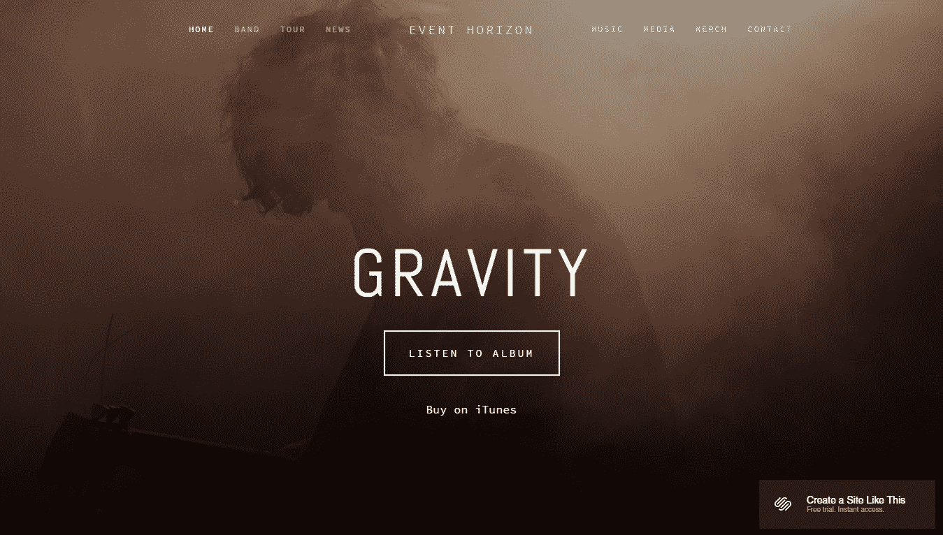
4. Horizon
Coming in next is this brand-centric template that is tailored to let content talk. Horizon comes with a suave index page, displaying full-bleed banner images and videos together. It can be used both by architecture firms looking to build a brand and also those wanting to sell products.
If you make the index page your home page, it will display content vertically from various pages. This makes for an impressive layout that draws people to your website. You can also lock the main navigation, which means it will remain at the top of the browser while scrolling.
Moreover, this template belongs to the Pacific family, which includes four other fan favorites.
Horizon can also host list-style blogs and sellable product pages. In addition to that, you can add a button for adding to the cart, which makes it easy for clients to buy from your website.
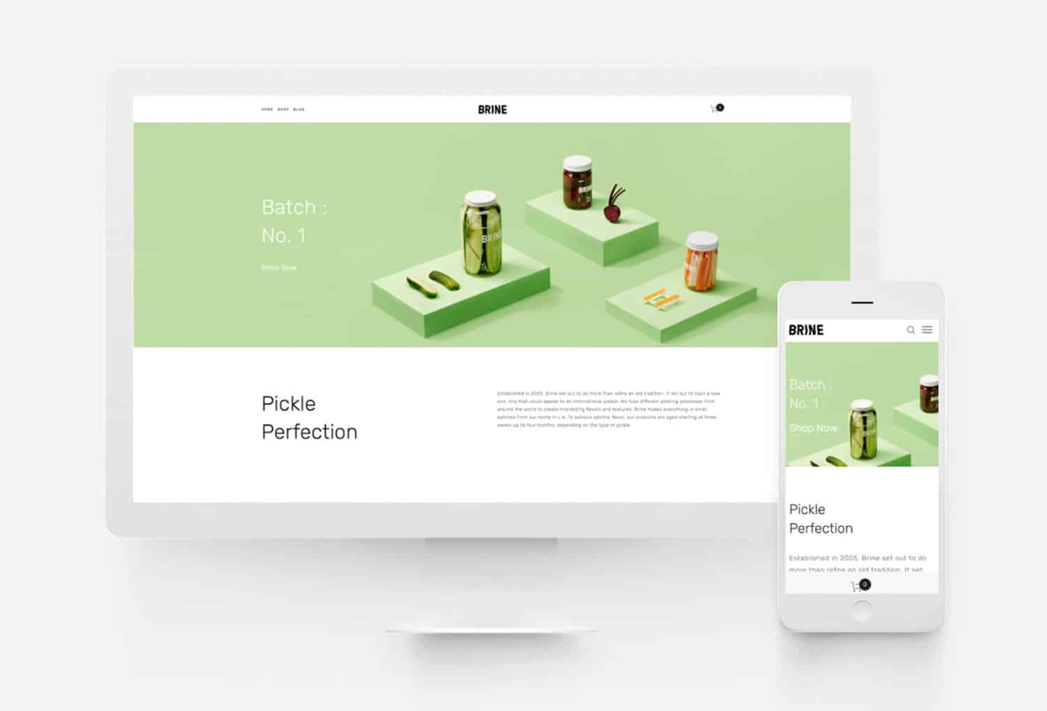
5. Brine
This is the most popular out of all the templates on the Squarespace platform. It is pretty flexible and offers limitless customization options. So, if you’re an established architecture brand and want to scale up your website performance significantly, then Brine is the one. And thanks to its ease of customization, you can tweak different features of the website to make it look unique.
Further, Brine offers extensive styling options for mobile and desktop. Its primary focus is the brand or company, and it achieves excellent results with the least effort. It can host blogs, an e-Commerce business, and an architecture portfolio. It also has a hover feature to allow customers to zoom into a picture.
In addition to that, you can insert content, navigate multiple areas, try out many blog layouts, customize share buttons, and scroll in parallelly. A sidebar is not present, but the massive list of features more than makes up for it.
6. Wav
Here we have a template with a modern design that displays a grid on the homepage. You can place your images there, and that’s it! Wav can also integrate with Soundcloud, so if you want to link your architectural podcast on the website, Wav makes it possible.
Since Wav belongs to the Brine family, it has all the features and functionality of a Brine template tool. This means that it’s super easy to have blogs or an e-Commerce shop, apart from publishing music and a portfolio.
7. Pursuit
This is another member of the Brine family and includes all the functionality of that template. Pursuit can help you create an attention-grabbing real estate website that is text-focused so that people can read about what a great professional you are!
It has a template design that looks like a CV but with bright Call to Action (CTA) buttons that catch the viewer’s eye.
Pursuit also has a stacked index page that collates all your skill graphs, previous experience, awards, education, etc., in one place. This is a handy tool for a budding architect who wants to put forth their resume online. This also ensures that your CV doesn’t get lost in the sea of job profiles on the internet.
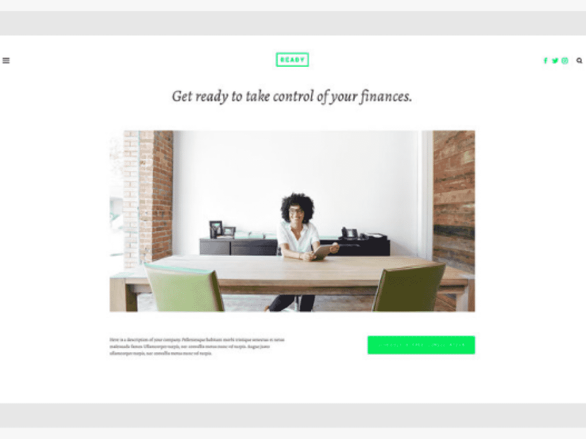
8. Ready
This template belongs to the Skye family and is stylish, minimalistic, and colorful. It has multiple hues of color on its display page, which will ensure that your architecture website grabs everyone’s attention.
Moreover, it is a multi-page theme that displays services on the home page and has separate pages for prices, contact details, and appointments. The responsive design of the Call to Action button allows for easy scheduling of appointments, which is a breeze to set up if one is using the built-in scheduling system of Squarespace.
Overall, we like how Ready has a clean and mobile-friendly design.
9. Nueva
Even though Squarespace offers multiple mobile-friendly templates, Nueva stands out from the rest when it comes to this. It has a neat and scrollable layout with montage-style galleries and headlines.
Since it is part of the Brine theme cluster, it is highly compatible with mobile devices.
10. Charlotte
This is a template from the Pacific group of themes. The most notable thing about its layout is the scrollable index page that can display full-bleed images with text overlays on them. In addition to that, if the index page is set as the home page, the navigation will be shuffled to the top.
Basically, it is a great template to showcase your photography and architecture portfolio and has a crisp, modern design.
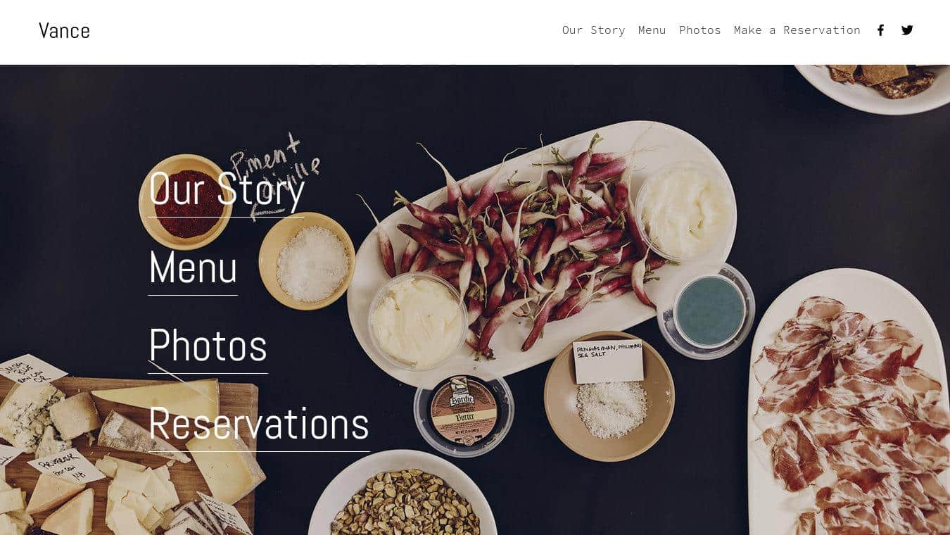
11. Vance
Vance is an easy-to-use template that requires minimal effort. The landing page of the template contains all major information about a business, like the products on offer and the location of the business. It even has the option of subscribing to a newsletter.
When working with Vance, one can add a “Who Are We” section to give relevant details about the architecture business. Plus, Vance has a user-friendly menu, the option of a photo gallery, as well as the option of taking bookings.
Though the mobile site isn’t as refined as the desktop one, it is still a useful template for architects.
12. Lusaka
Lusaka is older than most other Squarespace templates, but it is beneficial if you want to give out details about your architecture firm. It helps you tell potential clients a lot of information in a distinct, appealing way.
A collection of text and image overlays, coupled with small introductions for further information, is one of the features Lusaka offers. This will make your webpage look captivating but not verbose.
Further, the landing page is where you can give out tidbits of information that would then lure users into wanting to find out more. So, if you’ve got loads to talk about your design business, Lusaka is the ideal pick.
13. Almar
Almar is a template that not only sells your products to the clients but also gives a peek into the history and goals of your architectural firm. There is ample space on the template to try to sell your goods, as well as show what your brand is all about.
Additionally, this template supports blogs and a robust “About Us” section, which helps clients know more about the business. Hence, Almar is a great theme for architects needing something more commercial than a blog, but not exactly an online shop.
14. Carson
This visual-based template is perfect for your architecture firm if you have a lot of dramatic pictures to show off! Consequently, some of its highlights are full-size images, overlays, and various page options.
You can also customize the scrolling options and the font scale, which will make the template a little more personal. This architecture website template also offers room for experimentation- for example, you can choose to have slideshows or stick to scrolling.
Interestingly, Carson belongs to the Tremont family, so the mobile version of this template cannot be tweaked. But despite that, the website loads smoothly on mobiles.
15. Farro
This template’s best feature is its visually appealing blog layout. If your architecture firm has a successful blog, this template would be great for you since the layout of the landing page of the blog can be customized.
Additionally, the template supports e-Commerce and customization of any online shop you might want to open. You can additionally choose the way in which customers navigate a product page. You can further adjust colors and layout options, plus customers can zoom in on any pictures you post.
To add to that, Farro has a mobile-friendly design. However, no sidebars or index pages are with it, so some manual organization will be required.
Nevertheless, Farro makes for an excellent template for an architectural business and offers a lot of customization.
16. York
This template is specifically geared toward people who have a multi-dimensional portfolio and wish to display it all in one place. So, if you have a business apart from an architectural one, this is the template for you.
York has a stacked landing page, and when any visitor clicks on a box, the website will open up to another page, displaying a particular profile. As a result, you can have your architecture portfolio and a side hustle- all in the same place!
In case your business profile deals with selling products, York has the option to start an online business. To personalize your website, you can customize the fade effects, font scales, banners, and sliding speeds.
17. Marta
If you have a high-end business selling designer products, then Marta is the template for you. The design of this template will give your users the feeling as though they’re browsing through a glossy magazine, but they can directly purchase every product they see. Marta works especially well when the photos used are highly stylized and of great quality.
The template also offers the option of zooming into images, hovering over items on sale, and browsing with a quick-view setting. Since Marta also belongs to the Brine theme, it has all the core features of that template.
18. Hayden
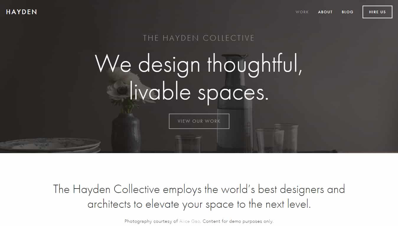
Hayden is an SEO-optimized template in which both the homepage and the content page include space for text, where you can write content that will enhance your online presence. The organization and category pages are especially focused on helping Google crawl across pages on your website. This ensures that your architecture portfolio, services, client reviews, etc., can be easily seen on Google.
Moreover, this template makes the site load in the form of a list, which means that any visitor must scroll to the bottom to see the entire content. Visitors can also use the in-built feature to make appointments to see you.

Conclusion
Now that you’ve explored the best Squarespace themes tailored for architecture professionals, the next step is identifying which template aligns with your studio’s identity, technical needs, and design philosophy. While all Squarespace templates are built on the same responsive framework—ensuring cross-device compatibility and performance—they differ in layout logic, typographic hierarchy, and visual emphasis. Your choice should reflect your architectural niche, whether it’s residential design, commercial projects, sustainable architecture, or interior planning.
Firms seeking robust image galleries and project tagging may lean toward Brine-based templates, while solo practitioners showcasing a conceptual architecture portfolio might prefer minimalist options like Vance or Five. Additionally, design-build practices or multidisciplinary studios can benefit from themes with integrated blog functionality, service pages, and contact forms—especially if they aim to grow in digitally competitive markets like those listed in the best cities for architects.
Ultimately, Squarespace offers a scalable and visually refined platform, making it an ideal digital foundation for architecture studios, freelance designers, and academic portfolios alike.
Related Articles
The Architect and His Career in the Social Media Era
Where to Apply for Architecture Jobs Online
The Best Architecture Portfolio Examples, Covers, Designs
10 Best Laptops for Architects and Designers
Techniques & Good Studying Habits of Architecture Students
Tips on How to Get an Architecture Job From a Post Online


