They say that you never get a second chance to make a great first impression and what better way to make a lasting impression of your home than with a warm and inviting foyer. Now, the term Foyer might not be familiar to you, however, we believe that you will be familiar with one of its many synonyms.
Simply put, the foyer is nothing but an entryway. Some might even call it a hallway, entrance hall or vestibule. It is the first place you step into after going through the door.
In this article, we will talk about the various ways you can decorate and design a foyer which will truly stand out and welcome your guests with a warm and inviting vibe. So read along to discover ideas to truly make a stunning first impression.
Ways to Style your Foyer
In this section, we will talk about various design aesthetics ranging from practical and going all the way up to ostentatious. So without further ado, let us begin with a practical yet beautifully designed foyer.
Practical and Aesthetic Foyer Designs
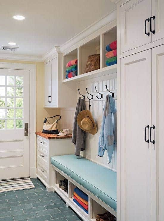
If you live in an area prone to harsh weather conditions, it is always smart to design an entryway with a strong focus on practicality. Practical does not have to be mundane by any means. Take a look at the image below for example. Not only is there enough storage space to put away your muddy boots and overcoats, but it manages to preserve a clean and beautiful look as well.
 via Pinterest
The entryway we see in further on is a slightly different take on the first image. Here, the cushioned seating area makes it a bit more welcoming in our opinion. When it comes to the subject of practicality, there is ample place to hang your coats and put away your shoes. Moreover, we love the combination of blue and white in this foyer.
 via Pinterest
Minimalistic Foyers
A good way to preserve the minimalistic look is by using a dominant element, like the beautiful console table we see below. The dark wooden complexion of the console table works well with the dark brown wall behind it. Moreover, the white doors and accents create a classy contrast with the dark elements.
 via Pinterest
The foyer you will encounter below follows the same philosophy of the first one. It creates a strong impression with the bold circular console table. Moreover, we love the use of ceiling lights in this example.
 via Pinterest
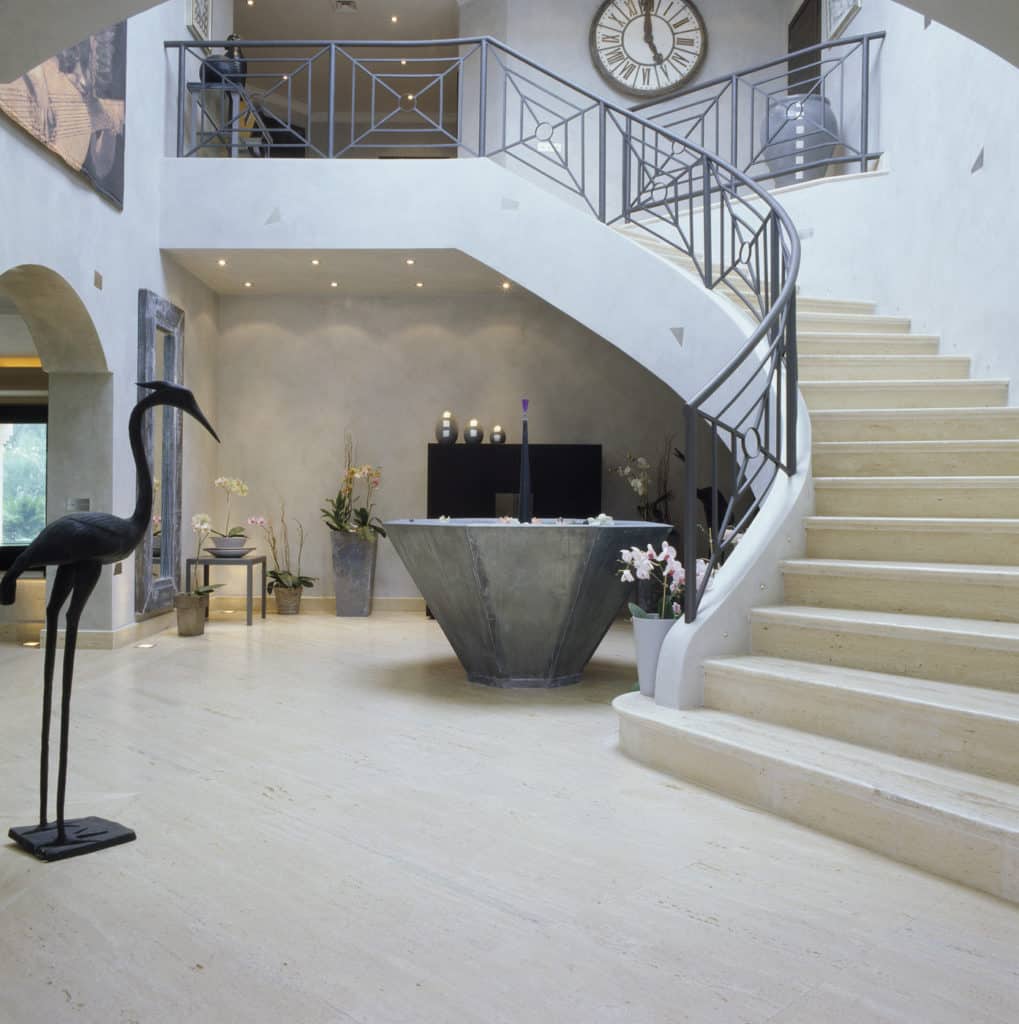
Here, we see a tasteful use of sculptures and flowers to create a lasting first impression. Notice how the colors of all the inanimate objects mostly fall in the taupe palette yet the use of flowers and tasteful lighting make the entire foyer seem lively and welcoming.
 via Pinterest
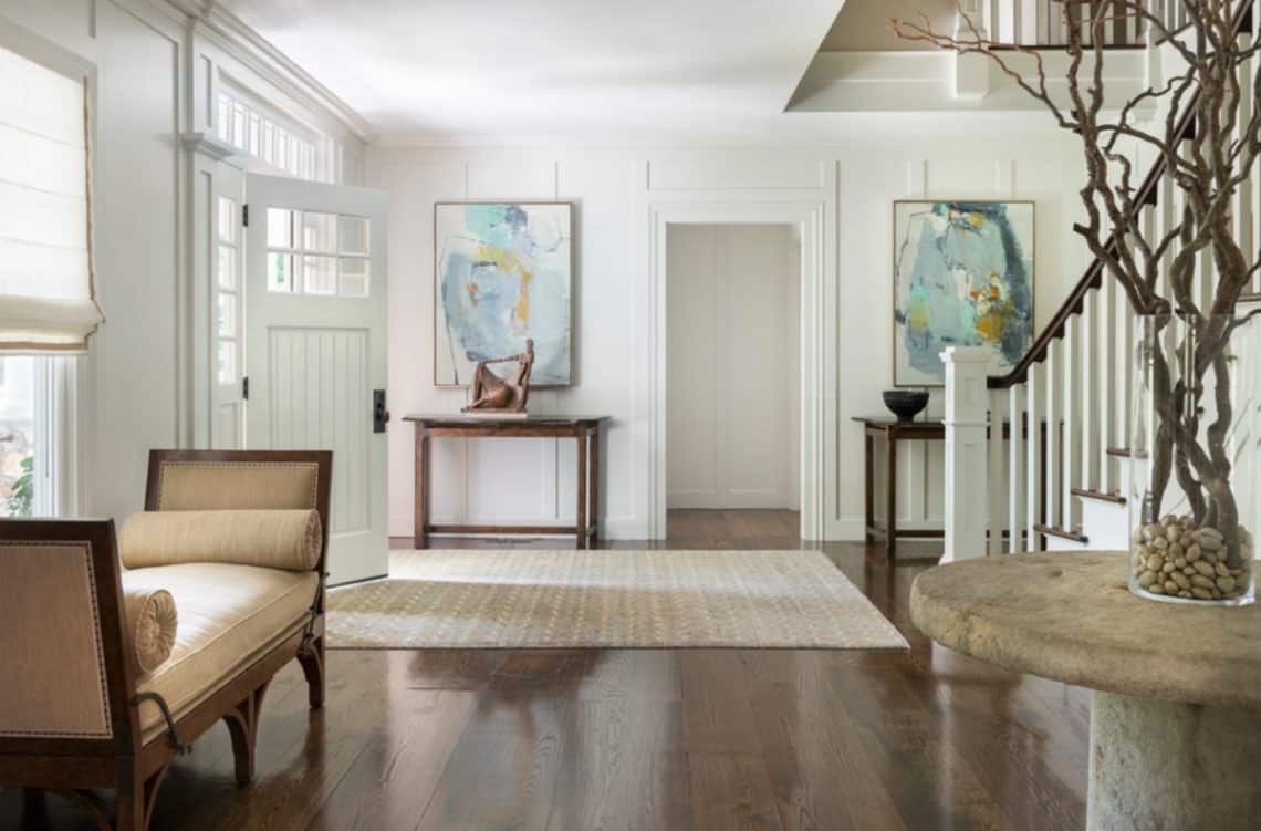
You can also make use of a large rug to accentuate your foyer as we see showcased below. The color of the rug and its herringbone pattern complement the other elements present in this picture thus creating a cohesive design.
 via Pinterest
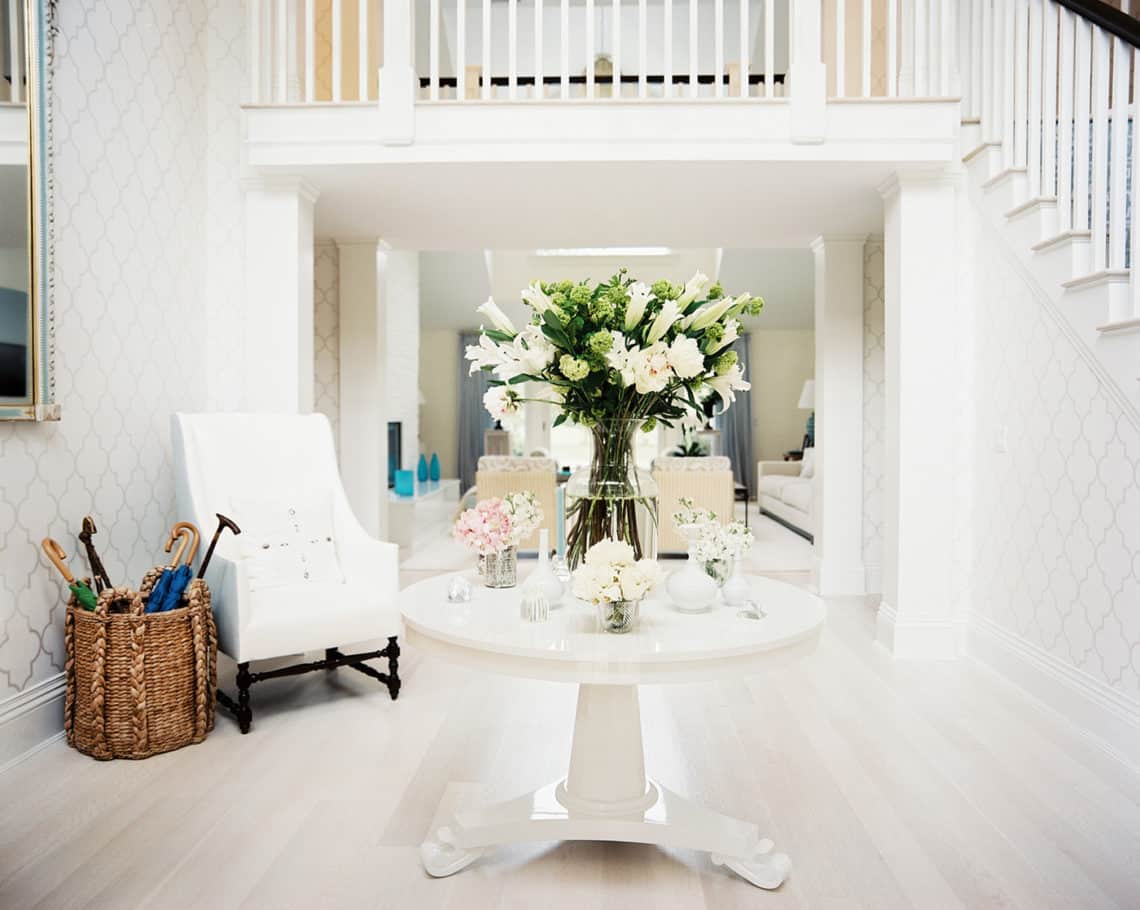
The foyer we observe in the impeccable picture below makes tasteful use of the white color and creates a strong impression with a dominant centerpiece. This is also a great example about decorating your entryway with flowers.
 via Pinterest
Extravagant Foyers
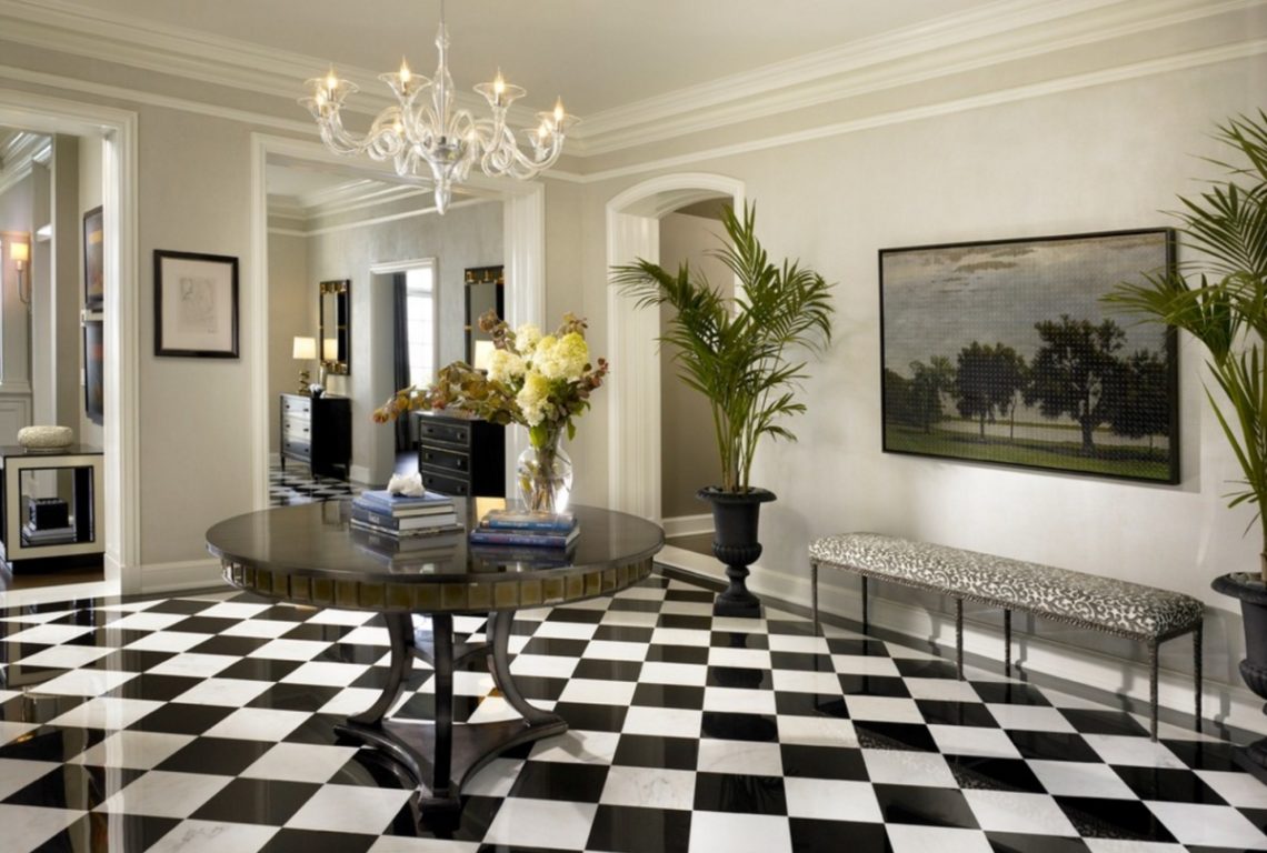
If you are the kind of person who is adamant about making a stellar first impression, then this section is dedicated to you. The dominant element in the entryway of below is surely the checkered floor. The use of black and white always creates a strong contrast, and in this case, it is also tastefully done. Moreover, we love the use of an old-school chandelier in this foyer.
 via Pinterest
Opulent, ostentatious, grandiose, lavish are some of the words that can be used to describe this entryway accurately. Even if the guests step out from a Rolls Royce or a Bentley, they are guaranteed to be visibly stunned by this stellar foyer. We love the symmetrical design of this foyer, especially the mirrored seating arrangements.
 via Pinterest
Old -School Charm
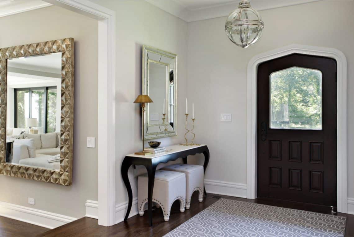
Using a mirror in your entryway can be not only practical but also save you a lot of time in choosing a suitable background element. Moreover, we love the use of compact ottomans in this example.
 via Pinterest
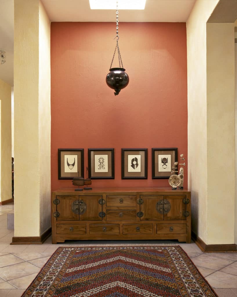
The example we see ahead is a great way to design a compact entryway. Here, you are greeted by a brightly colored wall adorned with beautiful antique elements. Notice how the bright chevron pattern rug accentuates the old-school charm of this foyer.
 via Pinterest
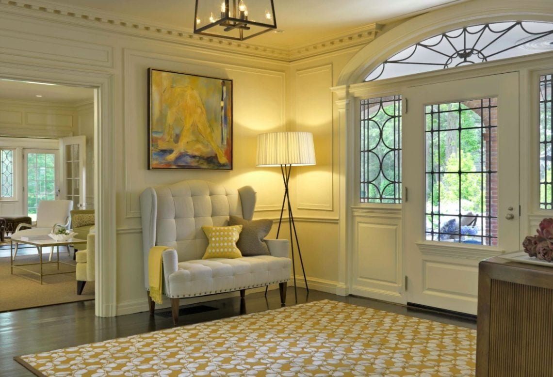
If you want your rug to make a strong statement, then take a look at below. The colors of this sizeable rug are tastefully used across the entire foyer, and that helps in creating a cohesive look.
 via Pinterest
The antique sofa flanked by the large black and white portrait induce a beautiful rustic charm in the above example. Moreover, the uneven dark flooring which might be considered tacky in any other environment looks like it was made for this entryway.
 via Pinterest
Before we bid adieu, let us end with a word of advice. The examples you saw in this article are here to help you come up with brilliant ideas to design your foyer. Always remember that your home represents your unique tastes, so design it in a way that fluently tells your story, that speaks of you and you alone.
Materialize your dreams, build you dream home, piece by piece.


