

White, gray, taupe, gold, mustard yellow, navy, blush pink, burnt orange, and black go with purple and green, and the reason each one works starts with the color wheel. Purple and green do go together, and Chevreul ranked green and violet, especially when light, above green and blue as a combination. Purple and green are not complementary colors on the traditional RYB painters’ wheel, where they are two of the three secondary colors, with orange, and where purple’s complement is yellow and green’s is red. On the Munsell wheel green’s complement is red purple, and in light it is magenta. Both colors are mixed with blue, green from yellow and blue and violet from blue and red, and by Chevreul’s account the two lose the blue they share when set side by side. Deep purples and deep greens such as Sherwin-Williams Concord Grape SW 6559 and Benjamin Moore Hunter Green 2041-10 sit at Light Reflectance Values of 5 and 6.39, so value, more than hue, explains why some purple-green rooms read rich and others read muddy.
Are Purple and Green Complementary Colors?
Purple and green are not complementary colors on the RYB wheel, and in color theory the full answer depends on which color wheel is in play. On the RYB wheel, the traditional painters’ model built from red, yellow and blue primaries, mixing any two primaries produces a secondary, red and yellow give orange, blue and yellow give green, and red and blue give violet. Purple and green are therefore both secondaries, two of three, and the color sitting opposite each is a primary, yellow opposite purple and red opposite green. Two secondaries cannot be complements of one another on this wheel, since a secondary’s complement is always a primary.
On the Munsell wheel, which spaces five principal hues, red, yellow, green, blue and purple, around one circle, the complement of 5G, green, is 5RP, red purple, and 5G plus 5RP, green plus red purple, combine to the neutral gray 5N at its center, so a red-leaning plum and a green do form a complementary pair in that system. One painter’s argument, published in 2022, sides with Munsell, holding that under his system red-green and yellow-purple are no longer complementary.
In light the answer shifts again. On the RGB model, the additive system of digital displays, two colors that mix in equal intensities to white are complementary, cyan sits across from red, magenta across from green and yellow across from blue, so a magenta-leaning purple and a green behave as a near-complementary pair on a screen. On the painters’ wheel the same two colors are a related secondary pair, which is worth checking before a screen palette becomes a paint order.
On the wheel that governs paint the pairing is a secondary-triad relationship, purple and green with orange as the absent third. Michel-Eugène Chevreul, whose 1839 study of simultaneous contrast set out the laws by which adjacent colors change each other, found that green set beside violet makes the violet redder and violet set beside green makes the green yellower, each color pushed toward the complement of its neighbor, red for green and greenish yellow for violet. Josef Albers, whose Interaction of Color was published in 1963, called color the most relative medium in art, so a plum that looked right on a chip changes character the moment a sage wall goes up beside it.
Why Some Purple-Green Rooms Read Rich and Others Read Muddy
Purple-green rooms go muddy through value. Deep purple and deep green sit within a few points of each other on the Light Reflectance Value scale, Sherwin-Williams Concord Grape SW 6559 at 5 and Benjamin Moore Hunter Green 2041-10 at 6.39, on a scale Sherwin-Williams runs from 0, which absorbs all light, to 100, which reflects all light, and prints on the back of every one of its color chips. A room that pairs an aubergine wall with a hunter-green sofa is pairing two colors of nearly identical darkness, and in an editorial reading the scheme goes muddy without either color being at fault.
Two moves solve it. Separate the pair by value, taking one deep and one light, and Concord Grape at 5 against Clary Sage at 41 opens a 36-point gap. Or hold both deep and let a light neutral carry the separation.
How to Balance Purple and Green in a Room
Benjamin Moore describes the 60-30-10 rule as a classic design strategy, 60% dominant color, 30% secondary and 10% accent. Give the sixty percent to a light neutral, not to either half of the pair, and let purple take thirty as the deeper anchor, with green at ten as the accent. Reversing purple and green gives a garden room instead of a jewel room, in an editorial reading, and moving either color up to the sixty share brings back the near-equal darkness the LRV chart shows.
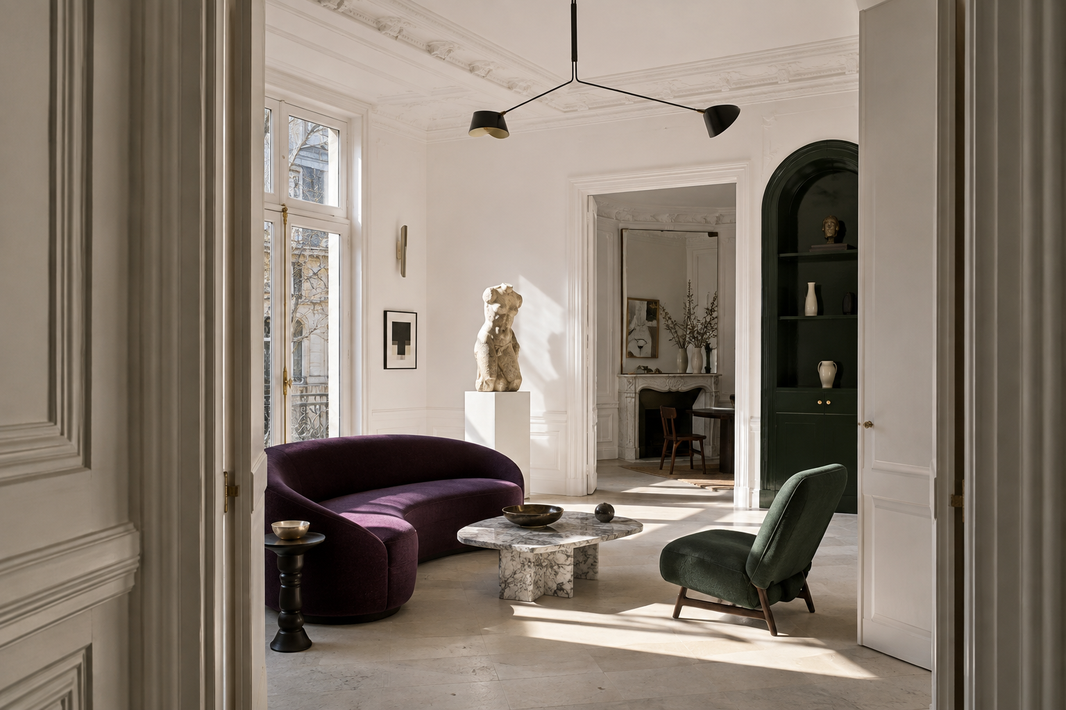
1. White Carries the Separation
White solves the value problem by value alone, and it belongs on the walls, not in the accents. Specify Sherwin-Williams Pure White 7005 at LRV 84 or Benjamin Moore Simply White OC-117 at 89.52, and the deep purple and deep green stop competing for the same register, since the white supplies the light the pair cannot supply for itself. Chevreul’s 1839 study found white beside green and violet not decidedly better than the pair alone, and found it better than gray or black in three-color arrangements with them.
2. Gray Cools the Pair Further
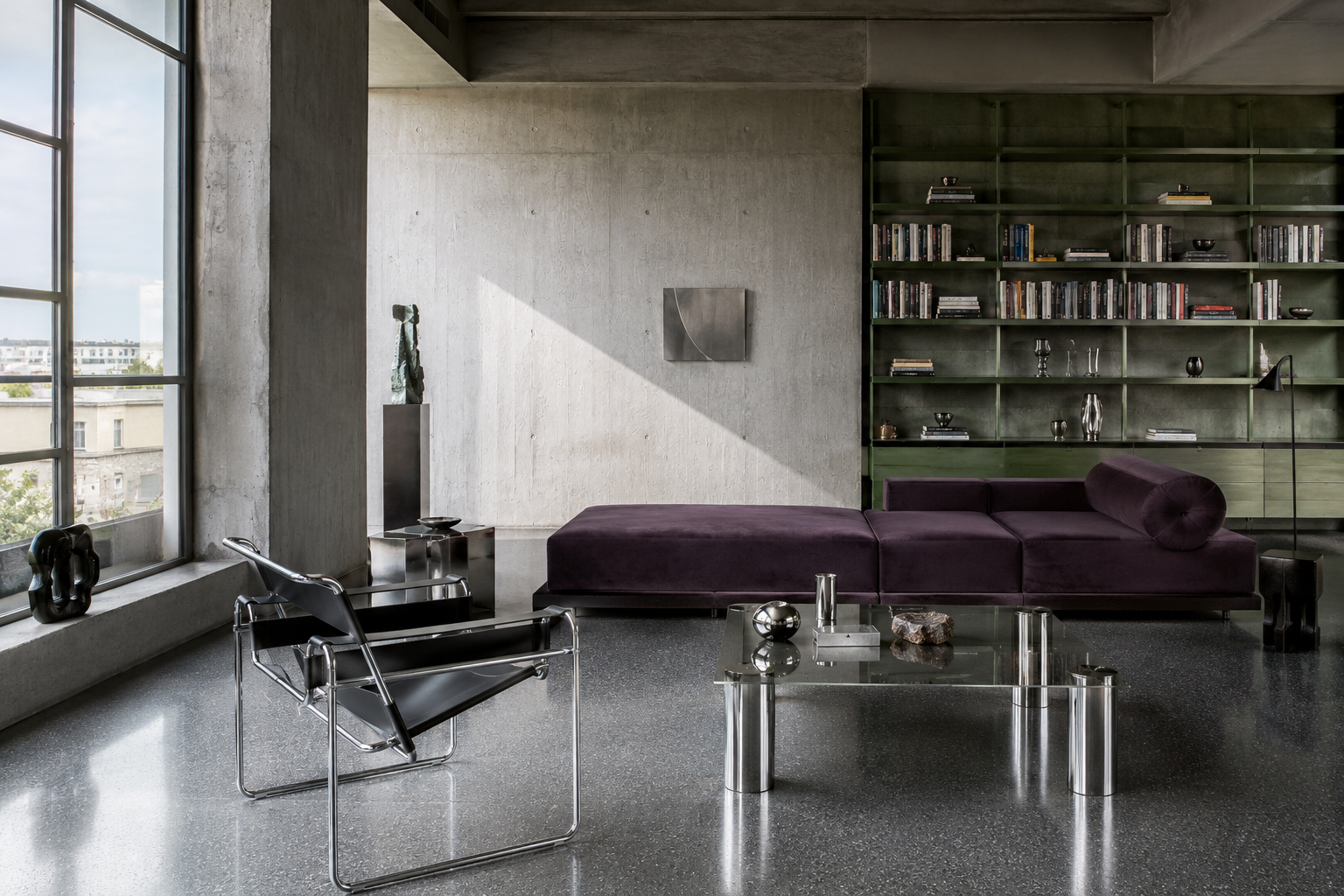
Gray keeps both colors in their cool register and asks nothing of the room’s warmth, which suits the scheme when the purple leans blue instead of red, an editorial reading of decorating practice more than a measured rule. Keep the gray light enough to open the value range, and let it take the largest surface, since a mid-gray at the same depth as the purple reproduces the crowding problem in a third color.
3. Taupe Warms What Gray Chills
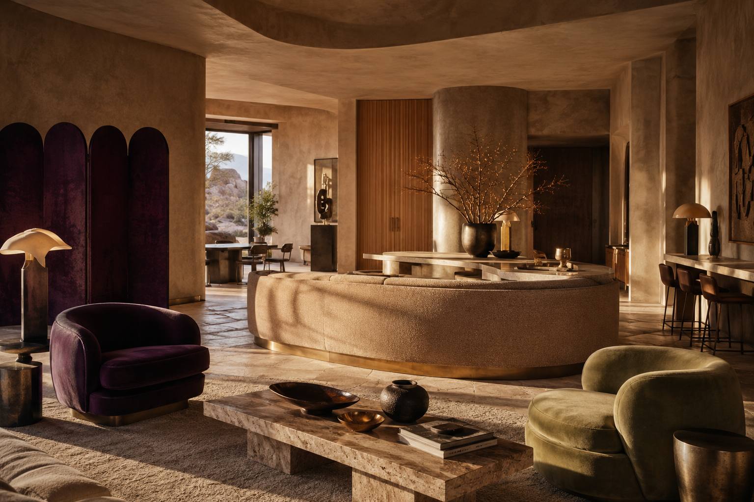
Taupe does gray’s job with warmth added, and in an editorial reading of decorating practice it is the better choice when the purple runs red, an aubergine or a plum, because the shared red undertone builds a bridge instead of a boundary. It suits upholstery and large soft surfaces, where a cool gray would read as clinical against a warm purple. Greige sits between the two and works when the room’s light shifts through the day.
4. Gold and Brass Complete the Heraldic Reading
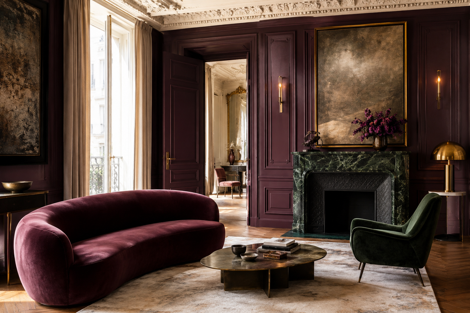
Gold works through the wheel, since yellow and purple are a complementary pair on the painters’ wheel and two complementary colors side by side appear brighter and more vivid than they would on their own, so a warm gold delivers complementary contrast against the purple. Brass hardware, gilt frames, or a small ochre accent lifts a purple-green room out of its cool register without disturbing the pair, in an editorial reading of decorating practice. Benjamin Moore Golden Honey 297, at LRV 72.82 a pale gold, gives the wall-color version, and brass gives the metallic one. In heraldry gold, or, is a metal while green and purple, vert and purpure, are colors, and since a color is very rarely placed upon a color, gold is a tincture that can lie on either one.
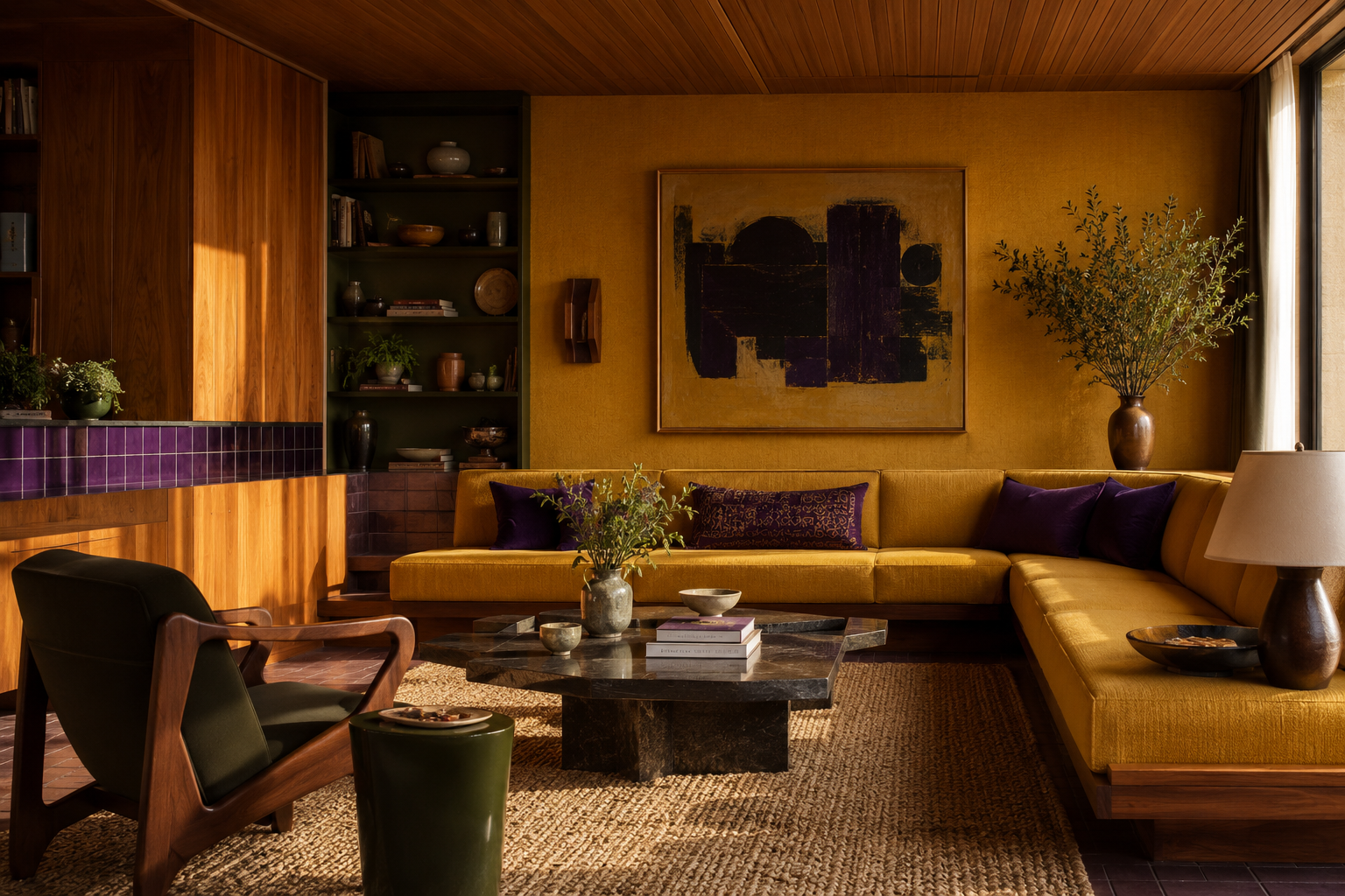
5. Mustard Yellow Runs Gold's Louder Version
Mustard is gold with the saturation turned up and the metal removed, and it works on the same complementary logic, yellow against purple, a pair Adobe’s design guidance lists among the basic complementary pairings. Use it at accent scale on textiles and keep the purple deep.
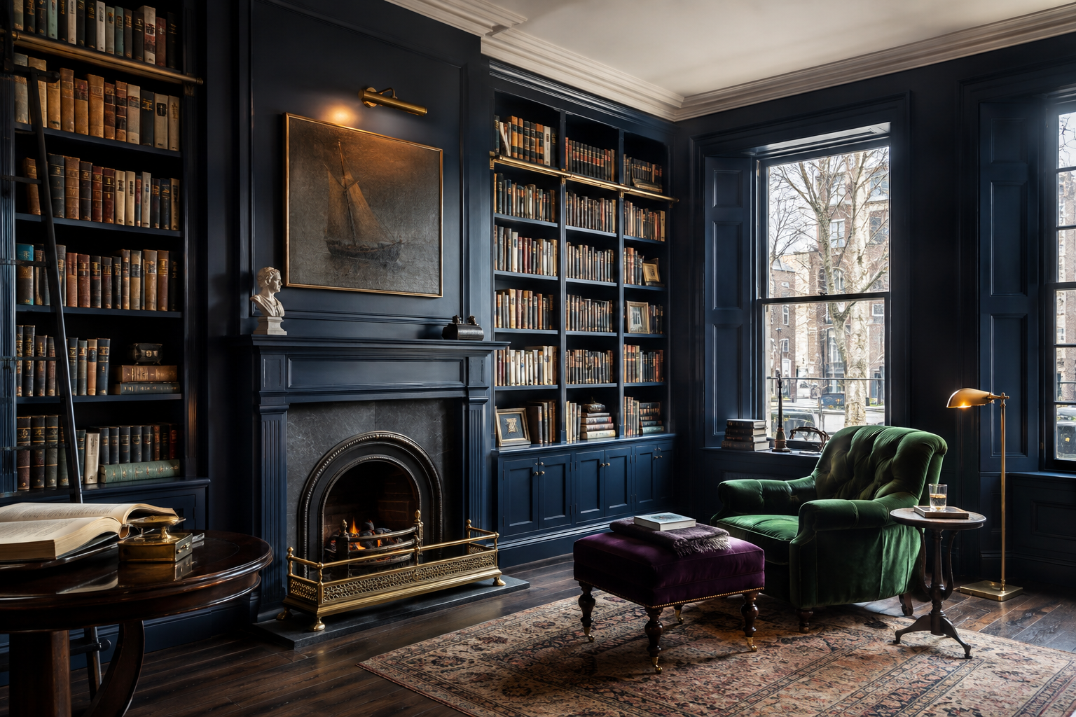
6. Navy Deepens Without Adding a New Hue
Navy shares the blue that purple and green are both mixed with, so in an editorial reading it joins the scheme as a relative of the pair, a deep anchor holding the floor while the purple and green work above it. Specify Sherwin-Williams Naval 6244 at LRV 4 or Benjamin Moore Hale Navy HC-154 at 8.36, put it on the lowest or heaviest elements, and give the room a light neutral above so three dark colors do not stack.
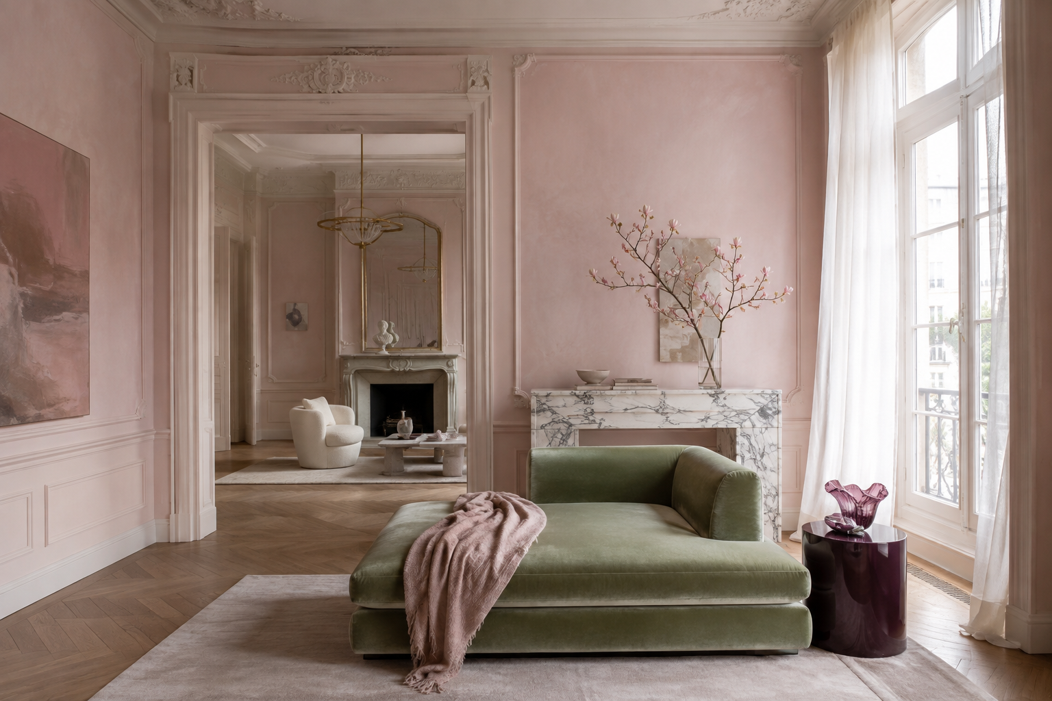
7. Blush Pink Softens the Purple's Edge
Blush reads as purple’s own family with the blue removed, an editorial reading and not a color-wheel rule, so it extends the scheme without interrupting it, and against green it produces the flower-and-stem reading in its gentlest form. Keep the pink pale and the green muted, a sage over an emerald, and the room reads as a garden in soft light. Bright pink with a deep green pushes the same pairing toward the tropical, which is a different room entirely.
8. Burnt Orange Supplies the Missing Third
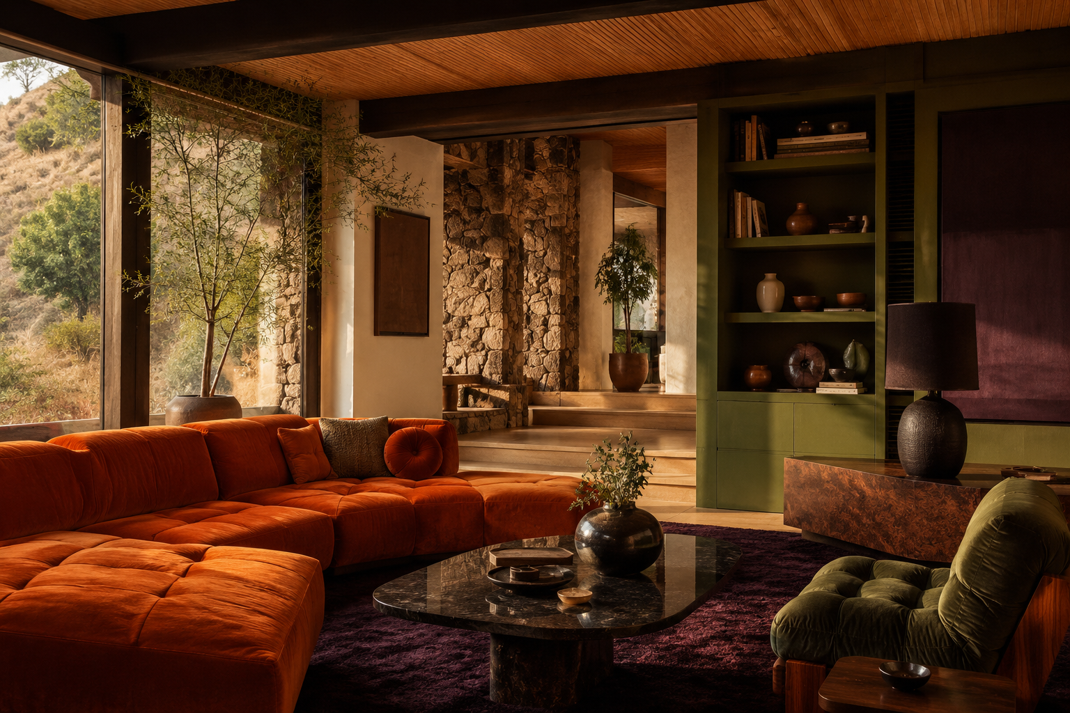
Orange is the secondary the pairing is missing, since green, orange and violet are the three secondaries of the RYB wheel, so adding it completes the set. In an editorial reading, burnt orange keeps the value deep enough to sit with the other two where a bright orange would not, and terracotta gives the same move in a mineral register. Use it at accent scale on one surface.
9. Black Draws the Lines
Black gives the scheme its edges, and in an editorial reading its lack of hue lets it separate purple from green without joining the color conversation. Specify Sherwin-Williams Tricorn Black 6258 at LRV 3 for trim, frames, and hardware, and keep it linear, never massed.
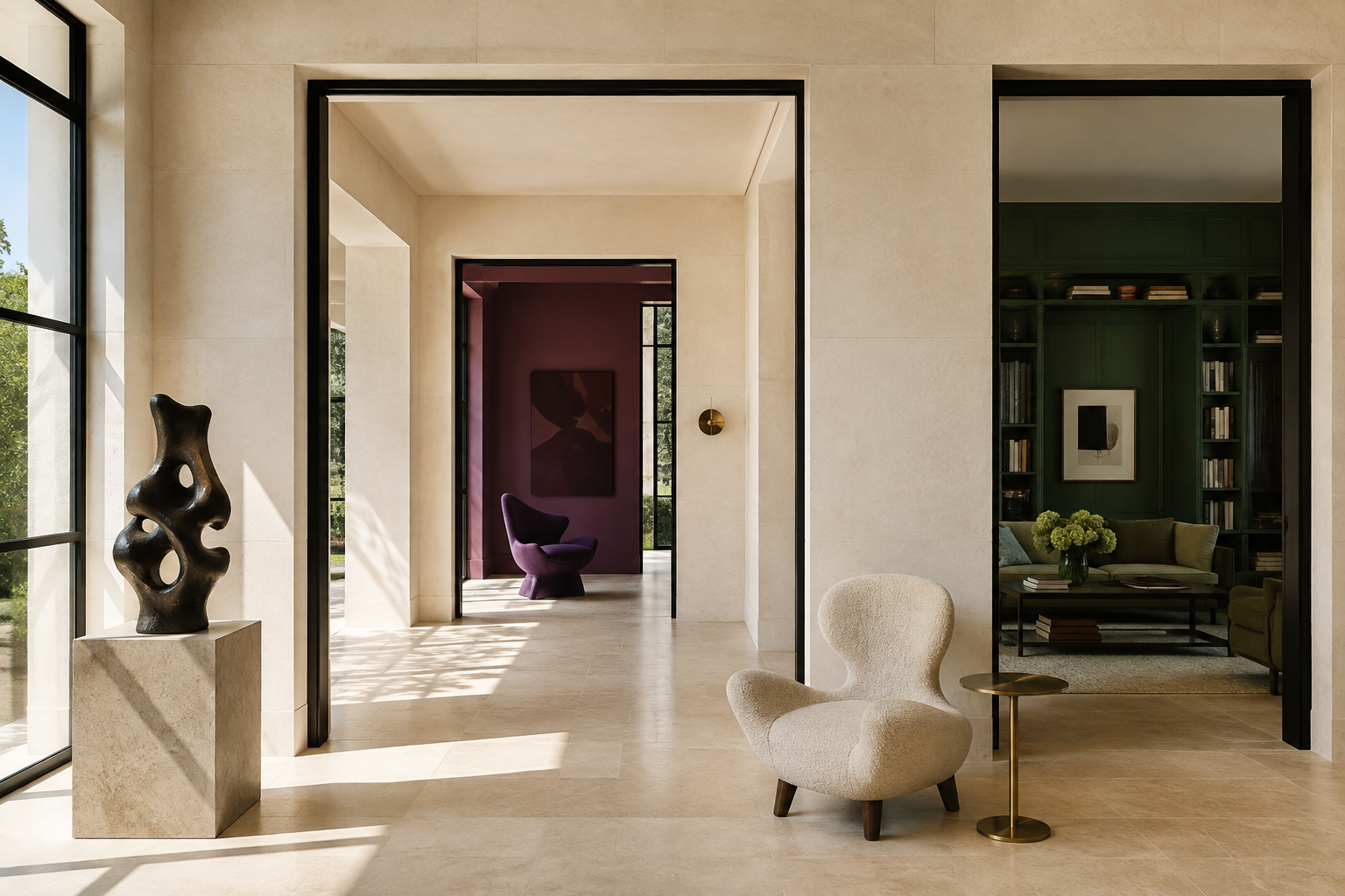
Where the Purple and Green Pairing Comes From
In May 1908, by the V&A’s record, Emmeline Pethick-Lawrence of the Women’s Social and Political Union chose purple, white, and green as the colors of the suffragettes, and the London Museum names her, WSPU treasurer and co-editor of Votes for Women, as the designer of the scheme. She set out what each color carried, purple the royal color for the royal blood that flows in the veins of every suffragette, the instinct of freedom and dignity, white for purity in private and public life, and green for hope and the emblem of spring.
| Partner | Why it works | Specify | Best use |
|---|---|---|---|
| White | Supplies the value separation the pair cannot supply itself | SW Pure White 7005 · BM Simply White OC-117 | Walls — the 60 percent |
| Gray | Holds both colors in their cool register | Light gray, specify by chip | Large surfaces, with blue-leaning purples |
| Taupe | Shares the red undertone of aubergine and plum | Taupe or greige, specify by chip | Upholstery, soft surfaces |
| Gold & brass | Yellow is purple’s RYB complement — real contrast | BM Golden Honey 297, a pale-gold wall · brass hardware | Hardware, frames, inside the accent share |
| Mustard yellow | The same complement, saturated and matte | Mustard, specify by chip | Textiles, one chair |
| Navy | Shares the blue both colors already contain | SW Naval 6244 · BM Hale Navy HC-154 | Lower cabinetry, heavy elements |
| Blush pink | Purple’s family with the blue removed | Blush, specify by chip | Bedrooms, with muted sage |
| Burnt orange | Completes the RYB secondary triad | Burnt orange or terracotta, by chip | One accent surface |
| Black | No hue, maximum value authority — draws edges | SW Tricorn Black 6258 · LRV 3 | Trim, frames, hardware |
Purple and Green Pairing FAQs
Do purple and green go together?
Yes, purple and green go together. Purple and green are two of the three secondary colors on the traditional RYB wheel, and both are mixed with blue. Pair them at clearly different values, a deep aubergine with a light sage over two dark tones, or add a light neutral to carry the separation.
Do dark green and purple go together?
Yes, dark green and purple go together once a light neutral or a clear value gap separates them, because deep greens such as Sherwin-Williams Shamrock SW 6454 and Benjamin Moore Emerald Isle 2039-20 sit at LRV 6 to 15.84 and deep purples such as Concord Grape SW 6559 and Benjamin Moore Shadow 2117-30 at 5 to 9.3. Chevreul found gray inferior to white beside green and violet, and found dark green, like violet, contrasts too much in tone with white to please as its light tones do. A lighter tone of one of the two, such as Benjamin Moore Silver Sage 506 at LRV 63.26, eases the step between the dark pair and the white, in an editorial reading.
Are purple and green complementary colors?
Purple and green are not complementary colors on the RYB artists’ wheel used for paint, where purple’s complement is yellow, green’s complement is red, and both are secondaries in a triad with orange. On the Munsell wheel green’s complement is 5RP, red purple, and in light, on the RGB model of screens, magenta sits across from green, so a red-leaning plum or a magenta-leaning purple reads as near-complementary to green.
What color goes best with purple and green?
White goes best with purple and green, because deep purple and deep green sit within a few points of each other on the Light Reflectance Value scale, Concord Grape SW 6559 at 5 and Hunter Green 2041-10 at 6.39, and a white such as Pure White SW 7005 at 84 or Simply White OC-117 at 89.52 restores the contrast. Gold and brass make a strong second in an editorial reading, since yellow is purple’s complement on the painters’ wheel.
What does the purple and green color combination mean?
The purple and green color combination means dignity and hope in the suffragette palette Emmeline Pethick-Lawrence devised in 1908, where purple stood for freedom and dignity, white for purity and green for hope and the emblem of spring. In an editorial reading of interiors the pairing is botanical, flower against stem, and moves toward the regal as the purple deepens, the regal feel Farrow & Ball names in its deep purple Pelt.
Related Article
What Colors Go With Red? Meaning, Design Tips & How to Use It at Home
What Colors Go With Brown? Meaning, Design Tips & How to Use Them at Home
What Colors Go With Navy Blue and White? Paint Codes, Theory & Rooms
What Colors Go With Black and Gold? Meaning, Paint Codes & Room Guide
What Color Goes With Tiffany Blue? Meaning, Design Tips & How to Use It at Home
Colors That Go With Blue + Things To Know
What Is Periwinkle Color? Meaning, Design Tips & How to Use It at Home
What Is the Espresso Color? Hex Range, Undertones & How to Use It
What Colors Go With Yellow? Meaning, Feng Shui Tips & How to Use It at Home
Hard Hat Color Codes & Their Meanings
What Is Mikado Color? Meaning, Design Tips & How to Use It at Home
What Color Is Teal? Meaning, Design Tips & How to Use It at Home
How to Use Lavender Color to Your Advantage in Home Decor
Colors That Go With Gray and How to Decorate With Gray
What is Chartreuse Color Is and How to Use It
What Colors Go With Brown? Meaning, Design Tips & How to Use Them at Home

