

Ivory, emerald green, deep navy, oxblood red, and walnut brown go with black and gold — the pairing already supplies the strongest value contrast a room can hold, a near-zero-reflectance black against a metallic mid-tone, so every successful partner works by tempering it rather than competing with it. Whites open the range and give gold a second surface to reflect onto, jewel greens and navies match gold’s saturation at black’s depth, and browns bridge the two through gold’s own earth undertone. This guide specifies the combination the way a materials schedule would — the blacks and golds by manufacturer name and code, fourteen partner colors with the mechanism that makes each work, the proportions and light behavior, and the three-thousand-year history that made black and gold read as authority long before it reached the paint aisle.
What a Black and Gold Color Scheme Means
The association is older than interior design by roughly three millennia, and it was built in three installments — each one a regime using the pairing to say the same thing about permanence and power. The reading survives intact in a modern room, and so does its double edge — held to accent scale, black and gold reads as authority and luxury; let the gold grow into a field, and the same pairing tips into excess.

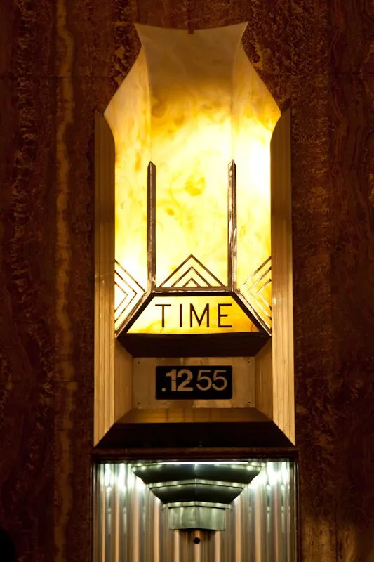
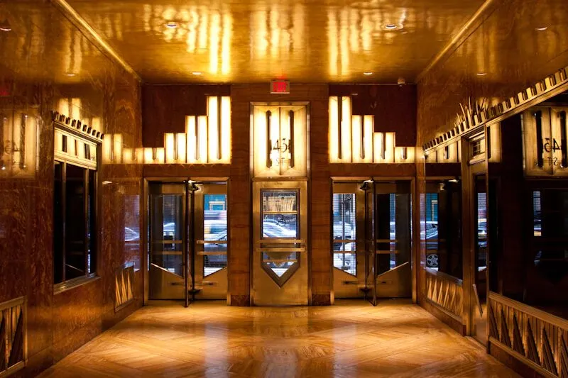
Black holds no position on any color wheel — it is achromatic — so black and gold cannot be complementary in the wheel sense, and no partner color needs to be. The pairing runs on Johannes Itten’s light–dark contrast, the strongest of the seven contrasts he catalogued in The Art of Color, and on the effect Michel-Eugène Chevreul described in 1839 as simultaneous contrast — a color reads more intense against its opposite in value, so gold sitting on black appears brighter and more saturated than the same gold on white. Partner colors succeed by holding their own in that field, as jewel tones deep enough to sit near black’s value or whites light enough to open it.
Light Reflectance Value is the number that makes the scheme predictable — the percentage of visible light a surface returns, 0 to 100, printed on every chip. The blacks here sit at 3 to 5 and absorb the room’s light, so gold’s 35 reads as luminous by contrast, and anything between roughly 10 and 20 joins the scheme as a deep partner instead of a competitor. The same physics sets the pairing’s one standing warning — under 2700 K warm lamps, golds push toward orange and blacks toward brown, while 4000 K neutral light holds both truer, so sample on the wall under the room’s actual lamps before committing.
How to Use Black and Gold — the 60-30-10 Split
The trade’s distribution rule — an inherited convention with no single author, and none needed — lands naturally here — the light neutral takes the walls at sixty percent, black takes the furniture and frames at thirty, and gold takes the ten percent that catches light. Inverting it, black walls with ivory furnishings, produces the dramatic version of the same room. Either way the gold behaves as punctuation, never as a field — hardware, frames, one fixture — because past accent scale the meaning of the scheme changes with it.
1. Emerald Green
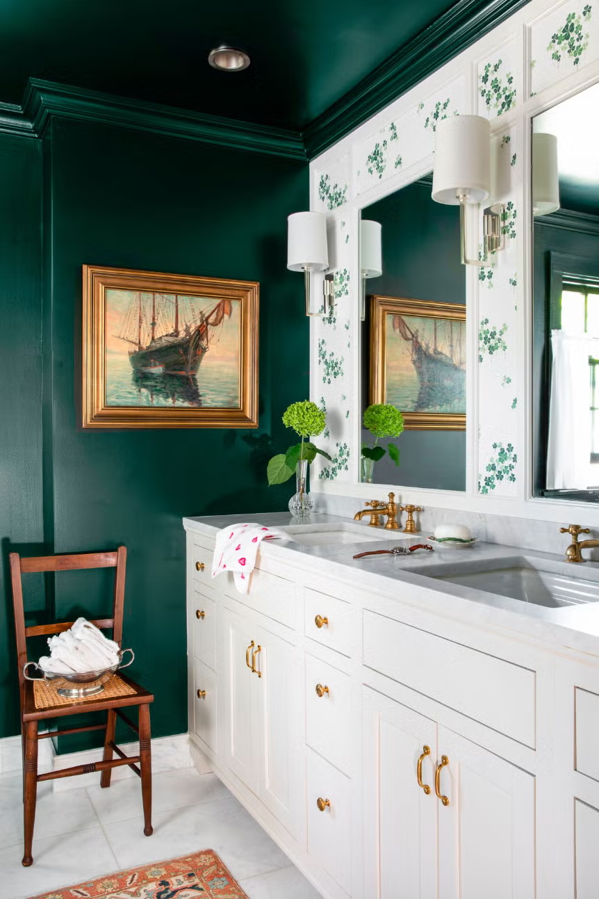
Emerald matches gold’s saturation at a depth black accepts — the jewel-box logic Art Deco lacquerwork ran on — so the three read as one register instead of three competitors. Specify Benjamin Moore Emerald Isle 2039-20, hex #008158 at LRV around 15.6, and give it a surface with presence: a velvet sofa, a lacquered cabinet, one wall behind the gold. The room announces itself; the black keeps it from shouting.

Source Unknown
2. Brown
Brown bridges black and gold through gold’s own earth undertone, and its strongest form here is the espresso-to-walnut band — dark enough to sit near black’s value, warm enough to answer the metal. Specify Behr Espresso Beans PPU5-01, hex #4C443E at LRV around 6, or let natural walnut carry it as floor and furniture; wood grain keeps the scheme from reading as pure graphics. Chocolate browns work the softer version of the same bridge.

Image Source
3. Bright Red
Red is the heraldic third — the color that shared banners with black and gold for centuries — and it carries gold’s warmth into black’s depth at full volume. Use it at object scale, one chair or the ground of a rug, and keep the value deep; a poppy red wants black outlines and gold restraint, because none of the three is a neutral and the room needs one. The quieter oxblood route has its own section below.

4. Bright Green
Bright and mint greens run the high-key version of the emerald move — maximum contrast against both partners, gold reading its warmest against a cool leaf green. It suits rooms that can afford one loud voice, a bar, a recreation room, a powder room, with black as the base layer and gold as the divider between the two. Where emerald whispers money, bright green grins.

5. Hot Pink
Hot pink flips the scheme’s gravity — pink and black take the field, gold drops to its minimum. It works where playfulness is the brief, and the discipline that saves it is the same ten-percent rule — pale golds, thin lines, sparingly placed, with black doing the outlining. Past that dose the room stops being designed and starts being decorated.

6. Silver
Silver joins gold only under one condition — black must dominate, so the two metals read as instruments against a dark ground, not as competing jewelry. Mixed metals went from taboo to standard practice in the last decade, and the black field is the reason the mix works: it gives each metal its own light to catch. Warm bulbs favor the gold, daylight favors the silver, and the room shifts register through the day.

7. Slate Gray
Gray and black sit too close in value to structure a room alone, and gold is the instrument that breaks the tie — against a slate field, a small amount of gold pops disproportionately, so the dose stays low. Specify the gray warm, not blue, place gold at strategic points, and let the near-monochrome do the sophistication. Iron Ore SW 7069 works as the soft black in this version.

8. Navy Blue
Navy reads as black’s cooler cousin, and gold hardware against navy is the pairing’s most forgiving domestic form — the version that survives kitchens, front doors, and bedrooms without theatrical commitment. Specify Sherwin-Williams Naval SW 6244, the brand’s 2020 Color of the Year, official hex #2F3D4C at LRV 4.458; white trim completes it and black grounds it. The royal reading the three produce together is the heraldic history doing its quiet work.

9. White
White opens the value range to its full width and gives gold a second surface to reflect onto — the scheme’s default sixty percent and the reason most successful black-and-gold rooms are, by area, white rooms. Specify Benjamin Moore Simply White OC-117, the brand’s 2016 Color of the Year at LRV around 90, or Sherwin-Williams Pure White 7005 at 84; both carry just enough warmth to keep gold from going brassy. The black draws the lines, the gold punctuates, the white does the living.

Source Unknown
10. Deep Purple
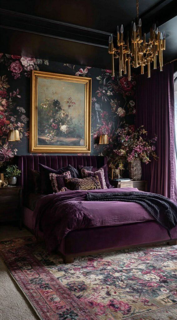
Purple brings the imperial register — the one color whose own history of restricted luxury matches gold’s — and its deep end sits comfortably at black’s value. Specify Benjamin Moore Shadow 2117-30, the brand’s 2017 Color of the Year, hex #514A58 at LRV around 7 to 9, or Sherwin-Williams Concord Grape 6559 at #443757 and LRV near 4.6; Farrow & Ball Brinjal No. 222 gives the aubergine version. Purple walls, black borders, gold at ten percent — the room needs nothing else loud.
11. Cream
Cream runs the white move at a lower temperature — soft, natural, and kinder to antique golds than a bright white, which can make old gilt look tired. Use it on the surrounds, doors, and windows framing a black-and-gold field, and shift the gold lighter with it so the pairing stays in one warmth family. Formal rooms take this version best; it reads as inherited rather than installed.

12. Teal
Teal runs the emerald logic shifted toward blue — regal against gold, at ease beside black, and tunable by depth — the darker the teal, the more gold the room accepts; the brighter, the more the black must hold it. It sits between the navy section and the emerald section as temperament, and rooms that find emerald expected and navy safe land here. Keep the value deep and the gold warm.

13. Oxblood and Burgundy
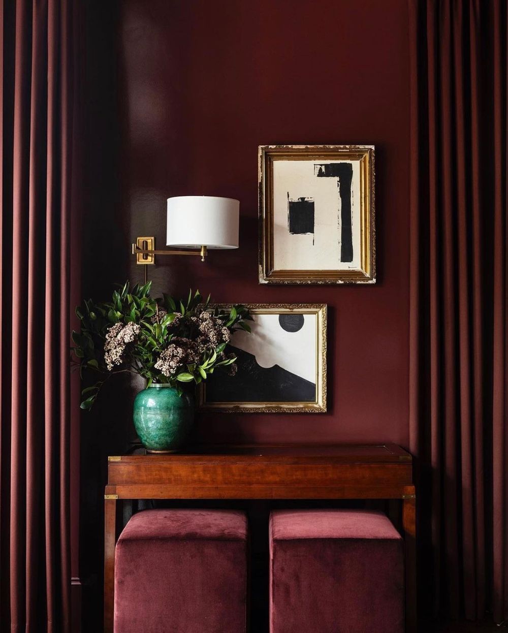
Oxblood is the bright-red section with its volume turned to the pairing’s own register — a deep red family at LRV under about 12 that carries warmth into black’s depth without asking for attention. It is the most heraldic of all the partners, the actual palette of banner and seal, and it suits leather, one wall, or the ground of a rug where bright red would suit only an object. Specify by chip in the deep red family and test under warm light, where oxblood and espresso begin to converse.
14. Hunter and Forest Green
Hunter green is the muted route to the emerald pairing — near black’s own value at LRV around 5, so it deepens the room instead of adding a third loud voice. Specify Benjamin Moore Hunter Green 2041-10, hex #2A453D, and let it take cabinetry, a library wall, or a study where emerald would perform; gold against hunter reads as old money the way gold against emerald reads as new. The green-black-gold triad at this depth is the quietest luxury in the whole guide.
| Partner | Why it works | Specify | Best use |
|---|---|---|---|
| Ivory & warm white | Opens the value range; gives gold a second reflecting surface | BM Simply White OC-117 · SW Pure White 7005 | Walls, ceilings — the 60 percent |
| Emerald | Matches gold’s saturation at black’s depth | BM Emerald Isle 2039-20 · #008158 | Velvet, lacquer, one wall |
| Hunter green | Near black’s value — depth without a third voice | BM Hunter Green 2041-10 · #2A453D | Libraries, cabinetry |
| Deep navy | Black’s cooler cousin; most forgiving domestic form | SW Naval 6244 · #2F3D4C | Kitchens, front doors, bedrooms |
| Oxblood & crimson | The heraldic third — warmth into depth | Deep red family, LRV under ≈ 12 | One chair, art, a rug’s ground |
| Walnut & espresso | Bridges the pair through gold’s earth undertone | Behr Espresso Beans PPU5-01 · #4C443E | Floors, furniture, leather |
A distinction the fan decks blur — Benjamin Moore Metallic Gold 2163-40 is a regular yellow-gold wall color, LRV 35, and not a metallic finish. For actual reflective gold, both majors sell dedicated products: Benjamin Moore’s Studio Finishes Molten Metallics line includes a true hammered-metal Gold, and Sherwin-Williams sells Illusions Metallic Technique Finishes in Gold alongside its Metallic Impressions collection. Specify the effect product for the ten percent; use the wall colors for fields.
The pairing that flatters a room punishes small lettering — WCAG’s thresholds, 4.5:1 contrast for normal text and 3:1 for large, sort the safe uses from the risky ones, and the same logic governs house numbers and anything typeset on a dark wall.
Colors That Go With Black and Gold FAQs
What does a black and gold color scheme mean?
Luxury, authority, and permanence — a reading built by Tutankhamun’s funerary gold, carried through imperial heraldry like the Holy Roman Empire’s black eagle on a gold field, and modernized by Art Deco. The pairing can also read as excess when the gold share grows past accent scale, so the meaning depends on the proportion as much as the colors.
How do you use black and gold in a living room?
Hold gold to roughly ten percent — hardware, frames, one light fixture — over a field of warm white walls and black furniture or trim, with one deep partner such as emerald velvet or walnut wood to soften the graphics. Black walls invert the formula and want the ivory moved onto the furnishings.
What colors go with gold if I skip the black?
Deep greens, navy, warm whites, and browns — the same partners, with the value contrast now supplied by the partner instead of by black. Navy with gold hardware and hunter green with antique gold are the two most specified versions.
Related Links
What Color Goes With Chocolate Brown
What Color Goes With Navy Blue And White
What Color Goes With Purple And Green
What Color Goes With Tiffany Blue
Hard Hat Color Codes & Their Meanings
What Color is Mikado and How You Can Use It in Your Home Décor
What Color is Teal and How You Can Use It in Your Home Décor
How to Use Lavender Color to Your Advantage in Home Décor
Colors That Go With Gray and How to Decorate With Gray
What Chartreuse Color Is and How to Use It in Home Décor Splendidly

