home/design & decorate/what is the espresso color? hex range, undertones & how to use it
Design & Decorate
What Is the Espresso Color? Hex Range, Undertones & How to Use It
Published 31 January 2022 · Updated 22 October 2026
In brief
Espresso color is a deep brown that can approach black, with undertones that vary by maker and finish. Minwax and General Finishes use the name for wood stains, while Resene Espresso, Benjamin Moore Espresso 2099-30 and PANTONE 19-1103 TCX identify different color references. Published hex values include #4E312D, #3B2F2F and #612718. Chocolate, walnut, mocha and coffee offer neighboring browns to compare on physical samples; ivory, sage and warm gray are palette options for espresso furniture. Wenge heartwood can have a similarly dark brown-to-black appearance.
Espresso color is a deep brown that can approach black, with undertones that vary by maker and finish. Minwax and General Finishes use the name for wood stains, while Resene Espresso, Benjamin Moore Espresso 2099-30 and PANTONE 19-1103 TCX identify different color references. Published hex values include #4E312D, #3B2F2F and #612718. Chocolate, walnut, mocha and coffee offer neighboring browns to compare on physical samples; ivory, sage and warm gray are palette options for espresso furniture. Wenge heartwood can have a similarly dark brown-to-black appearance.
The Espresso Range
Four published screen examples
Read on 22 October 2026. Resene and a paint database give different values for Resene Espresso; the other swatches are separately named examples.
#4E312D
Resene Espresso, the maker's own value, a brown based red at Ultra deep
#612718
A color-name dictionary, filed under Dark Red, and one paint database's figure for Resene Espresso
#4C443E
Behr Espresso Beans PPU5-01, from Samplize’s RGB value
#3B2F2F
Linearity’s guide, nearly black with a warm core
What the spread means
These examples carry Espresso or Espresso Beans names; ArtyClick files its Espresso under Dark Red. Wood species changes the final color of a stain, which is best tested on a hidden area of the wood, so furniture and cabinetry in espresso are judged on the physical sample and paint is specified by a maker's code.
What Color Is Espresso?
Espresso is a deep brown color, described as brown-based red by Resene and rich brown by Benjamin Moore. Light Reflectance Value measures reflected light on a scale from 0 to 100. Published figures checked on 22 October 2026 disagree: Benjamin Moore's US value for Espresso 2099-30 is 12.6, while Benjamin Moore France gives 11.1. Resene gives approximately 8 for its Espresso, while PaintDB lists 4. For Behr Espresso Beans PPU5-01, sample retailer Samplize lists 6.05 and PaintDB lists 30. Sherwin-Williams publishes 2.849 for Tricorn Black and 4.458 for Naval. Use the value attached to the specific maker and color code.
Espresso identifies several distinct color references. PANTONE 19-1103 TCX belongs to the Fashion, Home + Interiors Cotton TCX library and is classified as Neutral. Resene and Benjamin Moore make paint colors named Espresso, while Sherwin-Williams Espresso SW 3064 is a solid exterior stain color. Minwax Espresso 273 is a semi-transparent stain. The maker, product and opacity therefore belong in a finish specification alongside the color name.
Espresso vs Chocolate, Walnut, Mocha, and Coffee
| Color | Depth | Undertone | How to tell it apart |
|---|---|---|---|
| Espresso | Dark reddish brown in this sample | Red-leaning sample | Compare the maker and finish opacity |
| Chocolate | Mid-dark sample | Warm brown sample | Compare actual chocolate and espresso samples |
| Walnut | Mid-dark sample | Muted brown sample | Check the wood and stain separately |
| Mocha | Lightest selected sample | Muted milk-coffee sample | An option for a lighter neutral |
| Coffee brown | Medium selected sample | Warm brown sample | Compare under the room lighting |
Compare espresso and chocolate samples for depth and undertone. Pantone files its Espresso under Neutral; ArtyClick files #612718 under Dark Red. For wood finishes, opacity is a separate choice. Minwax sells a semi-transparent Espresso, while Sherwin-Williams lists a solid Espresso exterior stain.
Espresso Is a Finish Before It Is a Color
Espresso is a wood finish as well as a paint color. Minwax sells Espresso 273 in its penetrating oil-based Wood Finish and Espresso MW273 as a water-based semi-transparent stain. General Finishes also offers a water-based Espresso stain, demonstrated on a maple cabinet door. Minwax advises testing on a hidden area because wood species affects the final color. The University of Hamburg wood database describes wenge heartwood as brown to black with streaks. A sample used to approve an espresso restain should reproduce the intended preparation, stain and final finish, on a concealed area or a representative project sample.
General Finishes and Minwax supply espresso stains, and Sherwin-Williams Espresso SW 3064 is an exterior stain color. Specify the manufacturer, product and intended surface. Resene Espresso R35-034-035 and Benjamin Moore Espresso 2099-30 are paint-color references; cabinetry can receive paint or a stain system suited to its substrate.
How Espresso Behaves in Light
Espresso can look different under changing light, so judge a sample in the room where it will be used. Sherwin-Williams recommends higher-LRV colors for north-facing rooms and warm undertones when choosing a bold dark color. ENERGY STAR describes 2700K light as soft and warm, and 4100K or higher as whiter and crisper. Compare the sample under daylight and the intended lamps.
A stain sample belongs on a hidden area of the wood. Compare a paint sample in the intended room at different times of day. For a lighter neighbor, consider ivory or Benjamin Moore Simply White OC-117, which has an LRV of 89.52.
Join the Architecture Lab Collective.
Where Espresso Came From, and Where It Went
Resene Espresso appears in the maker’s Decks/driveways range of 2014 and Multi-finish range of 2016. Espresso also remains a named color in the paint, stain and textile references from Benjamin Moore, Minwax and Pantone. For existing espresso cabinets, a lighter surrounding palette is an option to test before replacing the finish.
1. Ivory and Cream Give It Somewhere to Breathe
Ivory and cream are lighter palette options beside espresso. Benjamin Moore describes Simply White OC-117 as a clean white with a slight hint of warmth. Consider it or a softer cream for the walls, then compare the sample against the furniture finish.
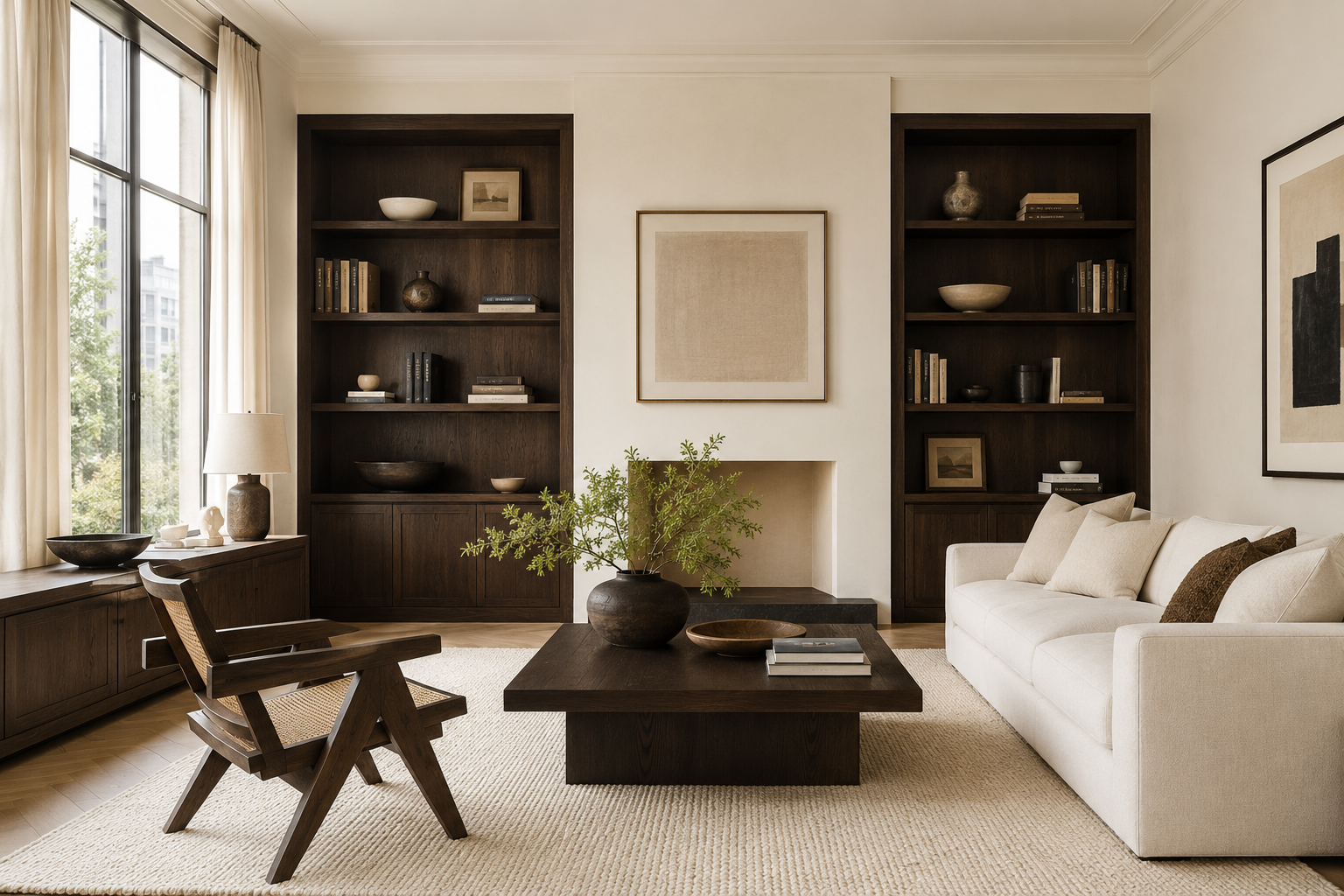
Espresso · Simply White BM OC-117 · cream, specify by chip
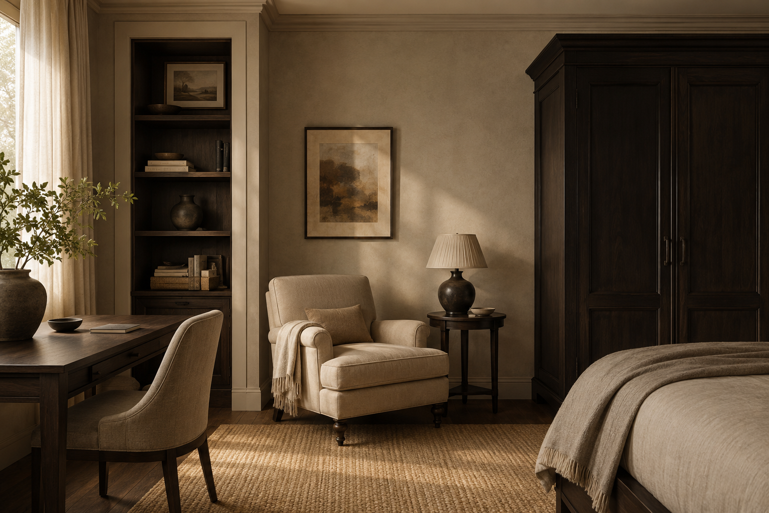
2. Beige and Greige Keep the Warmth Family Intact
Beige can provide a lighter neighbor for espresso furniture. With a red-leaning finish such as Resene Espresso, a warmer greige is an option to sample alongside the existing furniture. Sherwin-Williams recommends considering the undertones of both the floor and wall color.
Espresso Beans Behr PPU5-01 · beige · warm greige, specify by chip
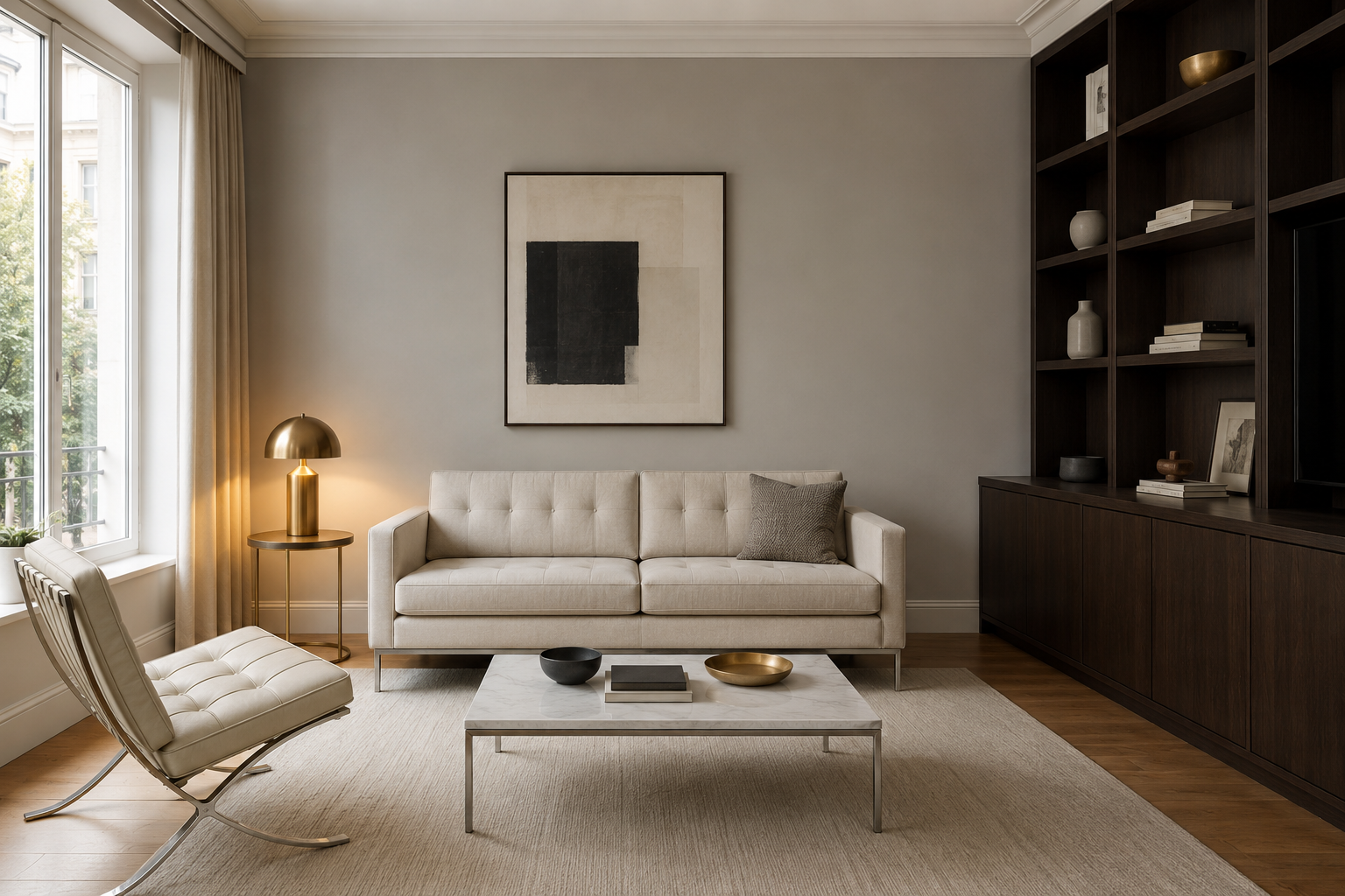
3. Pale Gray Can Work When It Runs Warm
Pale gray can accompany espresso. A warm gray with a touch of brown is one option for a red-leaning finish; a cooler brown may suit a cool gray. Test the samples together under the room’s lamps. Timber, brass or a natural-fiber rug are optional accents when the palette feels too cool.
Espresso · warm pale gray · warm mid gray, specify by chip
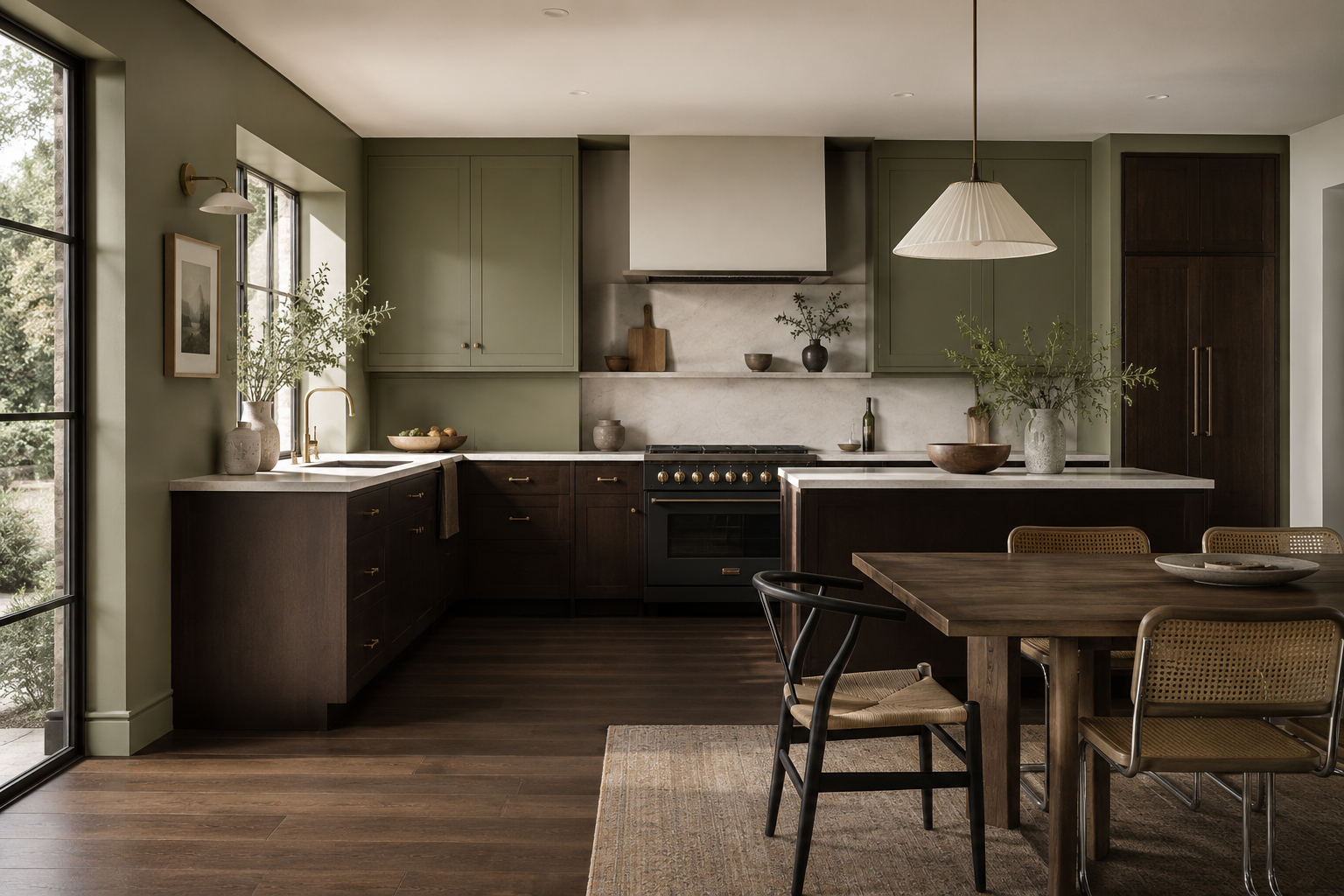
4. Sage and Olive Read as Landscape
Sage and olive bring green into an espresso palette. Sherwin-Williams Evergreen Fog 9130 has an LRV of about 30, while Clary Sage 6178 is lighter at about 41. Either green can occupy the walls or cabinetry, with espresso used for the floor underneath.
Espresso · Evergreen Fog SW 9130 · Clary Sage SW 6178
5. Brass and Gold Draw Out the Undertone
Brass and gold are warm accent options beside espresso, on hardware, lighting or frames. For a yellow wall color in the same palette, consider Benjamin Moore Golden Honey 297, which the maker describes as a breezy yellow and lists at an LRV of 72.82.
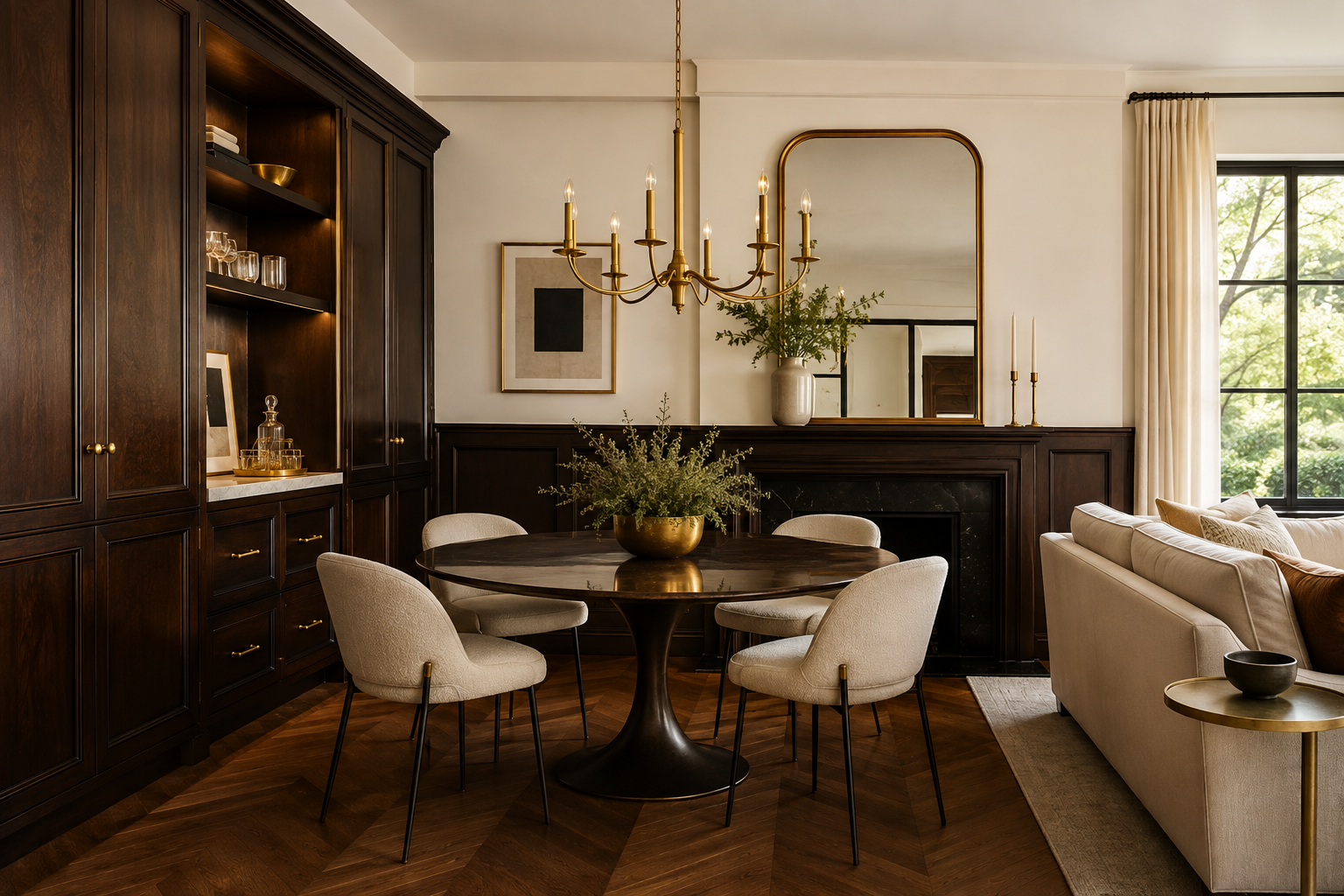
Espresso · Golden Honey BM 297 · Simply White BM OC-117
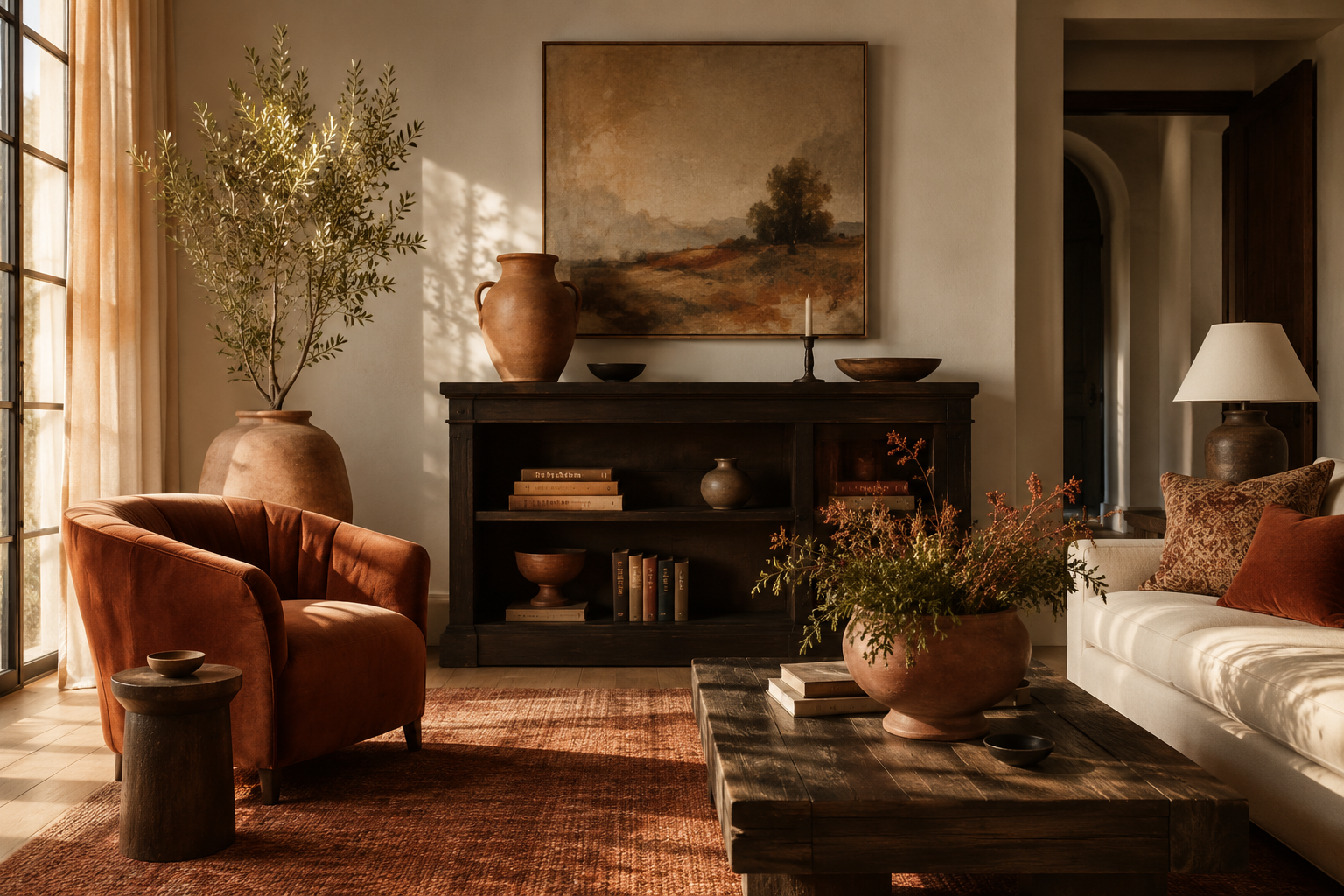
6. Terracotta and Rust Complete the Earth Palette
Terracotta and rust are accent options for red-leaning espresso; Resene places its Espresso in the Red palette. Consider rust upholstery, terracotta-colored ceramics or a single warm accent wall, with espresso on furniture or cabinetry and cream on the larger surrounding surfaces.
Espresso · terracotta, specify by chip · cream
Resene Espresso #4E312D has a calculated screen contrast ratio of 11.66 to 1 against white and 1.80 to 1 against black. Under WCAG 2.2 success criterion 1.4.6, the white pairing exceeds the AAA text-contrast threshold of 7 to 1. The black pairing fails both that threshold and the 4.5 to 1 threshold for large-scale text. These ratios assess color contrast; font size, weight and rendering also affect readability.
Espresso on white
Exceeds the AAA text-contrast threshold.
AAA contrast, Calculated 11.66:1 for Resene Espresso #4E312D on white.
Espresso on black
Fails the AAA text-contrast thresholds.
Fails, Calculated 1.80:1 on black.
Espresso Color FAQs
Is espresso black or brown?
Espresso is a brown color that can approach black. Benjamin Moore describes its version as rich brown; Resene calls its Espresso brown-based red. Wood grain visibility depends on the finish opacity, with semi-transparent Minwax Espresso and solid Sherwin-Williams Espresso representing different products.
Espresso warna apa?
Warna espresso adalah warna cokelat tua yang sangat gelap dan dapat tampak hampir hitam, seperti warna kopi. Espresso is a coffee-like dark brown whose undertones vary by maker, and Resene Espresso is #4E312D.
What is the hex code for espresso?
Espresso hex codes vary by source. Pages checked on 22 October 2026 give #4E312D for Resene’s own Espresso and #612718 for the same named color in a paint database. ArtyClick also uses #612718, while Linearity uses #3B2F2F. Samplize lists Behr Espresso Beans PPU5-01 as RGB 76, 68, 62, equivalent to #4C443E. PANTONE 19-1103 TCX is a separate textile color reference number. Specify furniture from a physical finish sample and paint by its maker’s color code.
What is the difference between espresso and dark walnut?
Espresso and dark walnut should be compared as specific finishes. Minwax lists Dark Walnut 2716 and Espresso 273 as separate semi-transparent Wood Finish stains, and says wood species affects their final appearance. For espresso, dark walnut or mahogany tones, compare samples on the same wood before deciding which looks darker in the room.
Does espresso furniture go with gray walls?
Espresso furniture can go with gray walls. Choose the gray alongside a sample of the actual finish: warm gray or greige is an option for a red-leaning brown, while cool gray can suit a cooler brown. Timber, brass or a natural-fiber rug can introduce a warmer accent.
Is espresso furniture outdated?
Espresso furniture can still work in a room; whether it looks outdated is a matter of taste. If espresso cabinets, floors and dark counters feel too heavy together, consider lighter walls or natural materials before replacing the furniture. Ivory and sage are two color scheme options to try against the existing finish.
Related Articles
What Colors Go With Red? Meaning, Design Tips & How to Use It at Home
What Colors Go With Brown? Meaning, Design Tips & How to Use Them at Home
What Colors Go With Navy Blue and White? Paint Codes, Theory & Rooms
What Colors Go With Purple and Green? Paint Codes, Theory & Rooms
What Colors Go With Black and Gold? Meaning, Paint Codes & Room Guide
What Color Goes With Tiffany Blue? Meaning, Design Tips & How to Use It at Home
What Colors Go With Yellow? Meaning, Feng Shui Tips & How to Use It at Home
Hard Hat Color Codes & Their Meanings
5 Best Papers for Prismacolor Pencils for Vibrant Results
9 Best Colored Fineliners For Journaling, Notes, And Detail Work
5 Best Watercolor Sketchbooks & Journals for Artists
What Is Mikado Color? Meaning, Design Tips & How to Use It at Home
What Is Walnut Color? Meaning, Design Tips & How to Use It at Home
What Color Is Teal? Meaning, Design Tips & How to Use It at Home
Join the Architecture Lab Collective
New projects, interviews and news from Architecture Lab, in your inbox.
Article by Anton Giuroiu for Architecture Lab · Published 31 January 2022 · Updated 22 October 2026