Red is a bold, emotionally resonant color that symbolizes passion, vitality, and energy, making it a standout choice in both modern and traditional interiors. Its high visual impact means it should be paired strategically with complementary tones to maintain harmony and prevent overstimulation. For a classic and balanced look, red pairs well with neutral shades like white, gray, beige, or black. For more daring and contemporary designs, consider combining red with navy blue, charcoal, blush pink, or even forest green. According to the Pantone Color Institute, red is psychologically stimulating and often associated with warmth and appetite, which is why it’s frequently used in kitchens, dining areas, and statement walls. Interior designers recommend leveraging red as an accent through accessories, upholstery, or cabinetry, especially when layered with textures such as wood, metal, or velvet. For those experimenting with warmer palettes, red can also align well with citrus hues and golden tones. For inspiration on other vibrant combinations, explore these expertly curated colors that go with yellow to expand your palette options with confidence.
What Colors Go With Red
Red Color-Matching Rules
For those who are unaware, one of the most valuable tools in the arsenal of artists and interior designers is the color wheel. A color wheel or circle represents the relationship between different colors, such as the primary, secondary, and tertiary colors.
But what exactly are these different types of colors? Color psychologists have classified colors into different categories. The first category is that of the primary colors, which include the colors red, blue, and yellow.
Secondary colors consist of orange, green, and purple, while the tertiary colors are yellow-orange, red-orange, red-purple, yellow-green, blue-green, and blue-purple. Complementary colors appear opposite to each other on the color wheel, such as red and green or yellow and purple.
Now, you may be aware that all colors come in several different shades, ranging from brighter to darker. For instance, you have cherry red, blood red, crimson red, bright red, and so on. Here, different shades of red will work best with a different color.
But despite being such a popular color and having several different shades, red may be a challenging color to work with. Let us take a look at how to find the perfect color combinations for red.
Finding The Right Color Combinations
There are several different techniques for matching colors and generating combinations. However, having a basic understanding of color theory can be highly advantageous for such purposes.
1. Triadic Color Scheme
The triadic color scheme is one of the most commonly used tools for understanding color combinations. It involves placing the three primary colors at an equal distance from each other on the color circle. Similarly, the secondary and tertiary colors are also placed at equal distances on the wheel.
All colors are distributed equally in this color scheme, and there is no superiority of any one color over another. However, you can play around with the ratios and how much of each color you will be using in a given space.
2. Monochromatic Color Scheme
The monochromatic color scheme involves selecting a single color and then using its various shades. The hues that differ in saturation and brightness can help create a sophisticated and polished appearance without appearing too dull.
For instance, you can paint an entire room red, using different shades on different walls and surfaces. It will provide uniformity while also helping make a statement. This technique is often used in areas where the aim is to focus attention on a particular object, such as in jewelry stores.
3. Analogous Color Scheme
An analogous color scheme entails selecting a single primary color, followed by choosing other shades close to that color on either side of the color circle. In simpler terms, this color scheme involves grouping similar colors together.
These colors have close relationships with one another, such as red, red-violet, and violet. Unlike some color combinations, this scheme does not go for a contrasting look and instead provides a more streamlined appearance.
4. Complementary Color Scheme
Complementary color schemes involve selecting a dominant color and then choosing colors that appear directly opposite it on the wheel. It helps in creating contrast and drawing attention.
Complementary colors appear across from each other on the color wheel, such as orange and blue or red and green. Such color combinations are one of the most commonly used color schemes and help make a bold statement. For instance, sports teams often don uniforms in complementary hues.
Now that you know about these basic color combination techniques, it is time to look at how to use red for the best results.
Implementing Red Color Schemes
Red is often one of the brightest and most vibrant colors in the palette and can evoke strong reactions instantly. That said, it is associated with intense emotions, such as passion, energy, energy, and so on. It is also one of the reasons why using red in various color schemes is such a challenging task.
Using too much color can create an overwhelming appearance, whereas using too little will make no difference to the existing color palette.
Due to the nature of the red color, it is best to use it in spaces that require energy, such as home offices or communal areas. On that note, living rooms, dining rooms, kitchens, etc., can do well with bright red tones. Red also has a strong connection with food, so using it in the kitchen or dining room is a good choice.
Avoid using too much red for living spaces as it can make such areas appear like a drive-through. Also, instead of sticking with a single shade, try using multiple shades ranging from bright tomato reds to deep moody maroons.
Red also looks excellent on wooden panels and trimmings, as well as focal points like doorways.
And once you have decided to go with a red color scheme, it is time to select the additional colors used in the combination. So, let us see which colors gel well with red.
Colors Most Suitable For Red Color Schemes
1. White
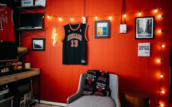
While most neutral colors work great with red, white in particular can be incredibly effective. That said, red-on-white creates an emphatic statement, as elements featuring red pigments are enhanced. Cream-colored or white walls with red accents will provide a clean, sleek appearance perfect for modern spaces.
If you think red is a bit too bold for your use, combining it with white spaces may also work well. Even in most traditional areas with primarily white spaces, adding just a hint of red can lend a touch of color to prevent blandness and bring vibrance.
Simply put, a bright white background with red pieces helps provide a pop with color, which helps break up the monotony. White can also be used for creating accents if the interior uses bold colors like red. It is a classic combination that can be used almost anywhere with excellent results.
2. Orange
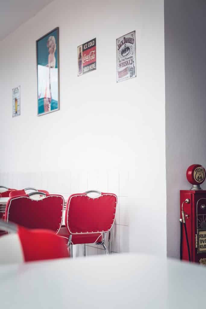
From a scientific point of view, red sits at one end of the spectrum of seven colors and has the longest wavelength. Using red with other colors on that end of the spectrum helps create an appearance of dimensionality while enhancing the vibrance of red.
That said, orange is one of the closest colors to red on the wheel and is ideally suited for this purpose. It can be beneficial for schemes such as the monochromatic color scheme, which utilizes similar or close shades of the primary color.
At the same time, combining red with various shades of orange and natural hues can help create a modern look for your living spaces. The boldness of red can be further enhanced by injecting orange elements or balanced out by using a neutral background.
3. Blue
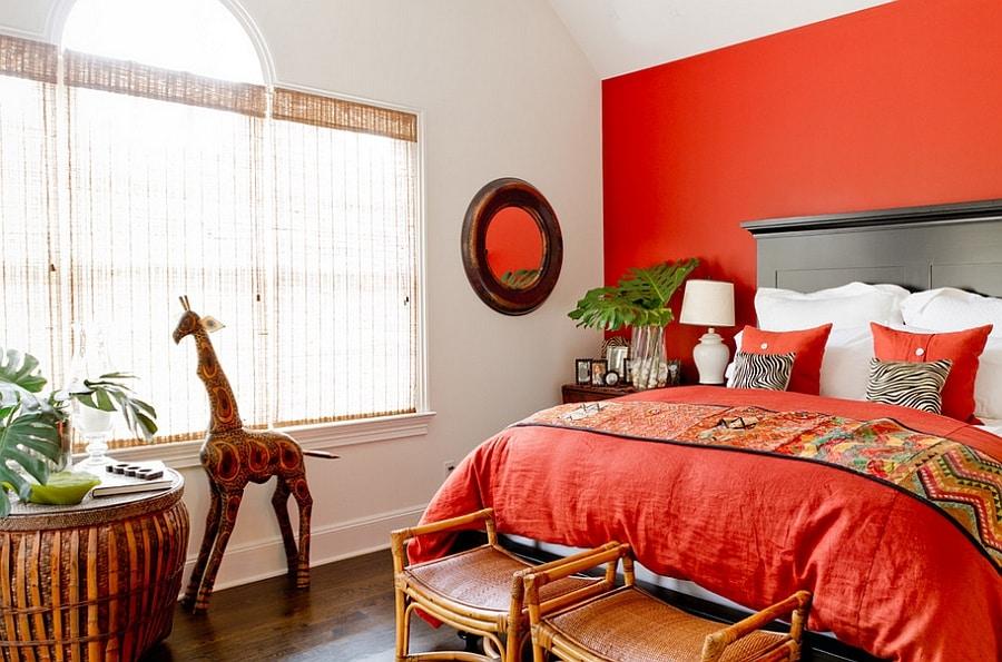
Blue is one of the best colors that can be used in various combinations with different shades of red. What makes blue such a great companion for red is that they are complementary colors. For creating vibrant spaces, use brighter shades of red with darker shades of blue such as navy, which will enhance the contrast.
Vibrant shades of blue can also help balance out the bolder hues of red, while darker blues can provide a feeling of coziness. The red and blue combination is also one of the classic looks that can be easily implemented and works great on several types of spaces. It works well in areas like kitchens and living rooms as well as for outdoor areas such as patios.
Experimenting with different shades of blue can help you create a modern yet classic look easily. Being a highly versatile color, blue can balance out the warmth of red while creating rich interiors.
4. Green
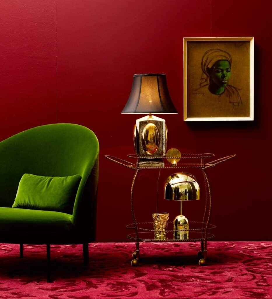
Green is one of the most effective colors in creating a contrast to red, which is why it is perfect for creating contrasting color schemes for your interiors. While red is a warm color that symbolizes heat, green is a cool color perfectly suited for mellowing out the brightness of red.
These two colors completely balance each other out, with the green helping tone down the boldness of red. Using lighter, softer shades of green, such as mint green, will help you avoid creating a space resembling Christmas decorations. Similarly, using olive green can also help prevent a holiday look for your interiors.
Jade green is another excellent option that you can pair with different shades of green to create a bohemian look. Opt for printed pieces instead of solid ones, which will help make a stunning appearance for your living space.
Source Unknown
5. Black
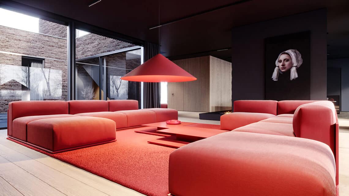
Another excellent option for interior design when decorating with red is to go with black or charcoal. The color combination of black and red is perfect for making a statement while creating a bold account. It helps create a dramatic effect while also offering a welcoming contrast.
Red and charcoal are ideally suited for a wide range of areas, from living and communal spaces to kitchens and even outdoors. Black also helps intensify any color you pair it with, making it challenging to use with red.
Additionally, combining it with a deeper, warmer shade of red can help you create a sophisticated and sleek appearance. It will also prevent your room an overwhelming look.
6. Pink
It is common to assume that red and pink should not be used together as they clash and can create a look reminiscent of Valentine’s Day. However, pink is one color that goes with red when used correctly and can help make a stunning appearance.
To provide a modern look, try using different shades of pink other than bubblegum pink, such as a shade of millennial pink or a subtle blush. Pink can also help draw attention to the brighter reds by acting as a neutral ground.
Pink can also be used in areas like bathrooms with pops of red to add color. Additionally, using pink, you can create a modern, romantic space easily. However, to prevent it from becoming overwhelming, select a more muted tone for either of the two hues.

7. Purple
Red and purple is another one of those color combinations that can help create a unique moody look. Since both these colors are located on opposite ends of the color spectrum, most people think they do not sit well together. However, selecting the proper shades can help you create a striking décor scheme.
This combination can be used to create accents on neutral ground, which will help the colors stand out more. Pendant lights and marble tabletops are among the best surfaces where you can quickly implement this color scheme.
The good idea is to use shades that have the same level of saturation, which will help create a balanced look. Purple, which is associated with royalty, can also add character to living spaces. It is one of the best color combinations to use in areas such as bedrooms.

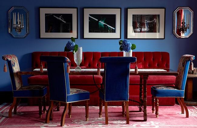
8. Natural Wood
The color of natural wood is one of the most versatile and can be easily combined with different shades of red. This color combination can be easily used in a wide variety of spaces, ranging from a study and home office to a bachelor pad and more.
One excellent trick when using natural wood or stained wood with red is to maintain the same warmth throughout the space. Both colors have warm undertones, and browns can also mellow out even the boldest shades of red.
The combination of red and natural wood will help you create a space that feels cozy and warm. If you intend to give your living space a more masculine appearance, then this is one of the best options to go with.
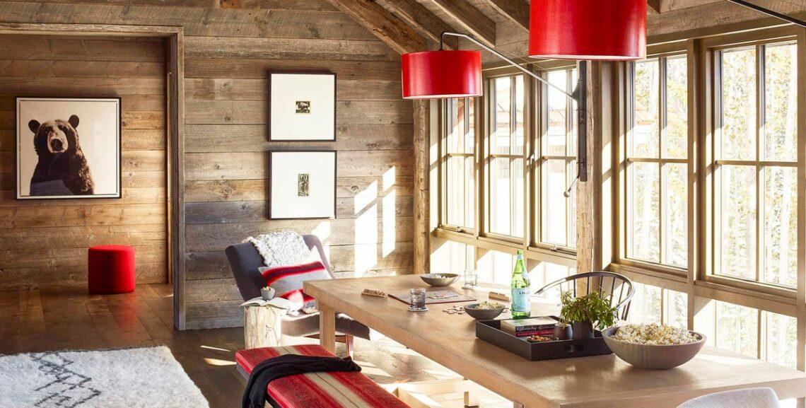
Photo Courtesy of ERIC PIASECKI

As mentioned above, red is one of the most challenging colors to work with. That is why it is vital to select the right color combinations which will help you offset or enhance the boldness and warmth of red, as required.
While finding the correct color combination will take some time and effort, it will result in creating the perfect living space that you are sure to love. Make sure to try out different color combinations and experiment.
On that note, we will be signing off. Until next time!
Related Links
What Color Goes With Chocolate Brown
What Color Goes With Navy Blue And White
What Color Goes With Purple And Green
What Color Goes With Black And Gold
What Color Goes With Tiffany Blue
Hard Hat Color Codes & Their Meanings
What Color is Mikado and How You Can Use It in Your Home Décor
What Color is Teal and How You Can Use It in Your Home Décor
How to Use Lavender Color to Your Advantage in Home Décor
Colors That Go With Gray and How to Decorate With Gray
What Chartreuse Color Is and How to Use It in Home Décor Splendidly


