

Brass and gold, mustard yellow, olive green, caramel brown, coral, blush pink, warm gray, and natural wood go with navy blue and white — and the pairing accepts all of them because it is not really a color scheme at first. Navy and white is a value structure: the deepest usable blue against the lightest available neutral, Sherwin-Williams Naval at a Light Reflectance Value of 4.458 against Pure White at 84, a gap of nearly eighty points on a hundred-point scale. That gap is the widest of any classic combination, so navy and white can carry an accent color without crowding, and the accent’s job becomes adding warmth instead of contrast. This guide gives the naval history behind the pairing, the verified paint codes for both halves, the undertone rules that decide which white belongs with which navy, and nine partner colors with the mechanism behind each.
Where Navy Blue and White Came From
The pairing is a uniform before it is a decorating scheme, and the date is documentable. In April 1748 the Royal Navy issued its first regulations for officers’ dress under Lord Anson, specifying dark blue and white — the combination that gave the color its name. The shade was called marine blue at first, and navy blue entered general English usage later, with the Oxford English Dictionary dating the term to 1813. The often-repeated story that George II chose it after admiring the Duchess of Bedford’s blue-and-white riding habit is charming and apocryphal, and the practical explanation is stronger — indigo-dyed broadcloth held its color at sea, and white showed rank and cleanliness against it.
Everything the pairing means in a room descends from that origin. Navy and white reads as order, competence, and weather-resistance, and it settled naturally into coastal architecture, club interiors, and the striped textiles that still carry the association. The nautical reading is the pairing’s gift and its trap — a designer working with it decides early whether to lean into the reference or to break it, and the accent color is usually the instrument of that decision.
Why Navy and White Works Without Trying
Navy and white is the widest value gap in common use. Sherwin-Williams Naval publishes a Light Reflectance Value of 4.458, and Pure White sits at 84 — a separation of nearly eighty points on the hundred-point scale that measures how much visible light a surface returns. Deep purple and deep green, by comparison, sit within four points of each other. That difference explains why navy-and-white rooms rarely fail and why purple-and-green rooms so often do.
The practical consequence is that navy and white have already solved the contrast problem before any third color arrives, so the accent’s job is warmth rather than separation. It also means the pairing tolerates large fields of both — navy across full-height cabinetry with white above will not crowd a room the way two dark colors would. The one genuine decision left is undertone. Benjamin Moore Hale Navy carries subtle gray-green undertones and asks for a warmer white such as White Dove or Simply White; Sherwin-Williams Naval runs more saturated and cleaner, and accepts a near-neutral white like Pure White without going icy. Pairing a cool navy with a cool white produces the clinical version of this scheme, and the fix is one warm white away.
How Much Navy, How Much White
The trade’s 60-30-10 distribution — an inherited convention with no single author, and none needed — has two correct readings here, and the room’s light decides between them. In a bright room, navy takes sixty on the walls or the cabinetry with white at thirty on trim and ceilings; in a darker room, reverse them so white carries the field and navy anchors the lower third. Either way the accent holds at ten percent, and its warmth is the whole point. The most-specified version of this scheme in recent years puts navy on lower cabinetry with white above, which reads as the reversal and the original at once.
1. Choosing the Right White
The pairing’s first decision sits inside itself, since white is not one color and the wrong one turns the scheme clinical. Benjamin Moore White Dove OC-17 and Simply White OC-117 both carry enough warmth to soften a cool navy, and Sherwin-Williams Pure White 7005 at LRV 84 stays near-neutral for navies that already run warm. Test the white against the navy in the room’s own light before ordering either, since a white that looks correct on a chip can turn blue-gray beside a saturated navy.
2. Brass and Gold Warm the Uniform
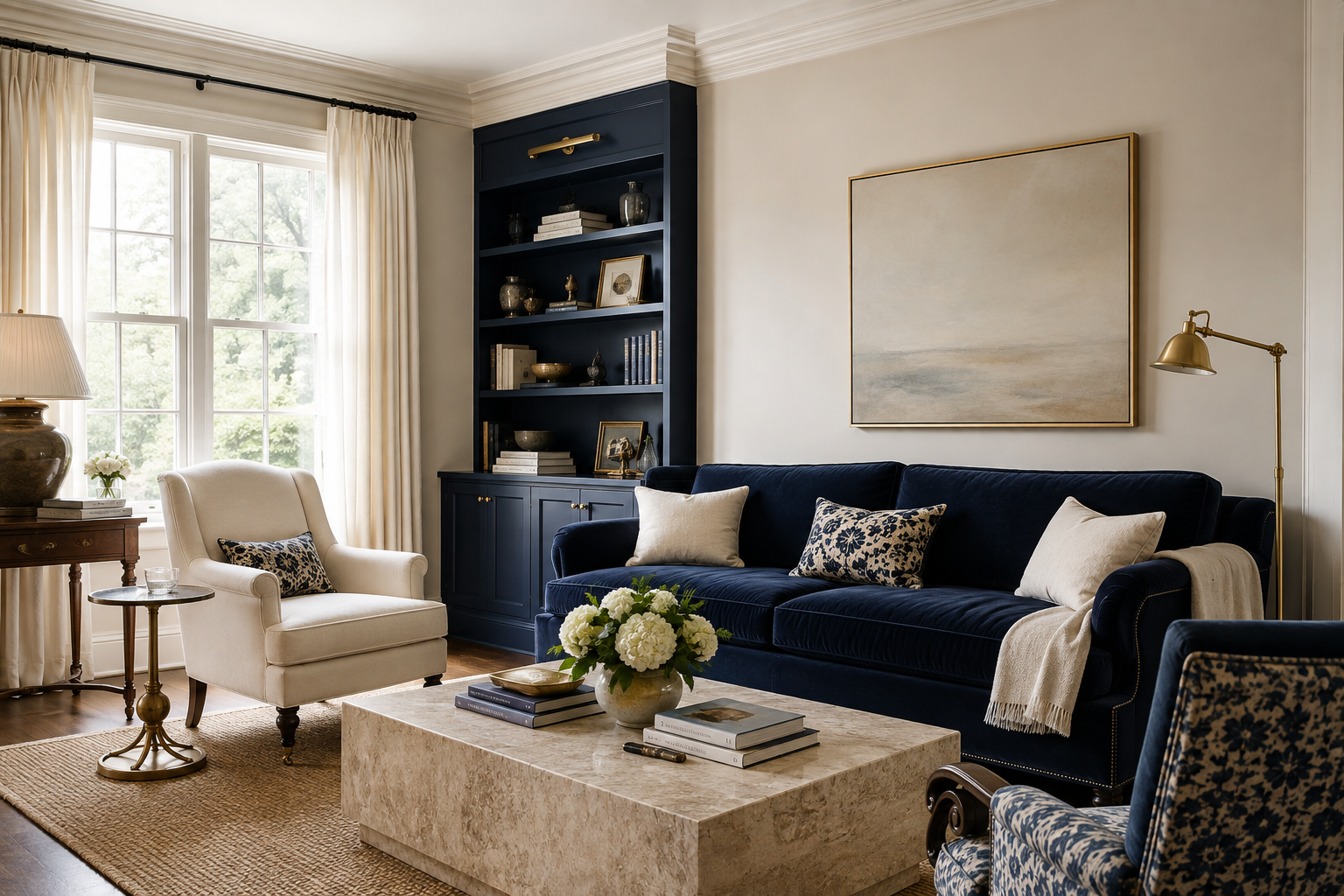
Brass is the accent navy and white ask for most often, and the reason is temperature, since two cool colors at maximum contrast produce a scheme that can read severe, and warm metal answers that without introducing a competing hue. Unlacquered brass hardware, a gold picture light, or Benjamin Moore Golden Honey 297 on a small surface will do the work at ten percent. The combination reads formal and slightly maritime, which is the register this pairing wears best.
3. Mustard and Ochre Break the Nautical Read
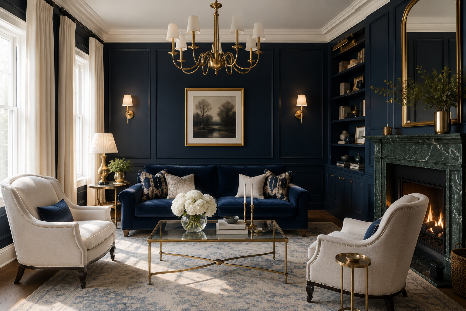
Mustard does brass’s warming job with saturation instead of shine, and it carries the scheme away from the sailing-club reference that navy and white otherwise fall into. A mustard sofa or ochre textile against navy walls and white trim reads mid-century, not maritime, which is the most common brief for this pairing in a living room. Keep the mustard muted, since a bright yellow against a saturated navy starts vibrating.
4. Olive and Sage Bring the Landscape In
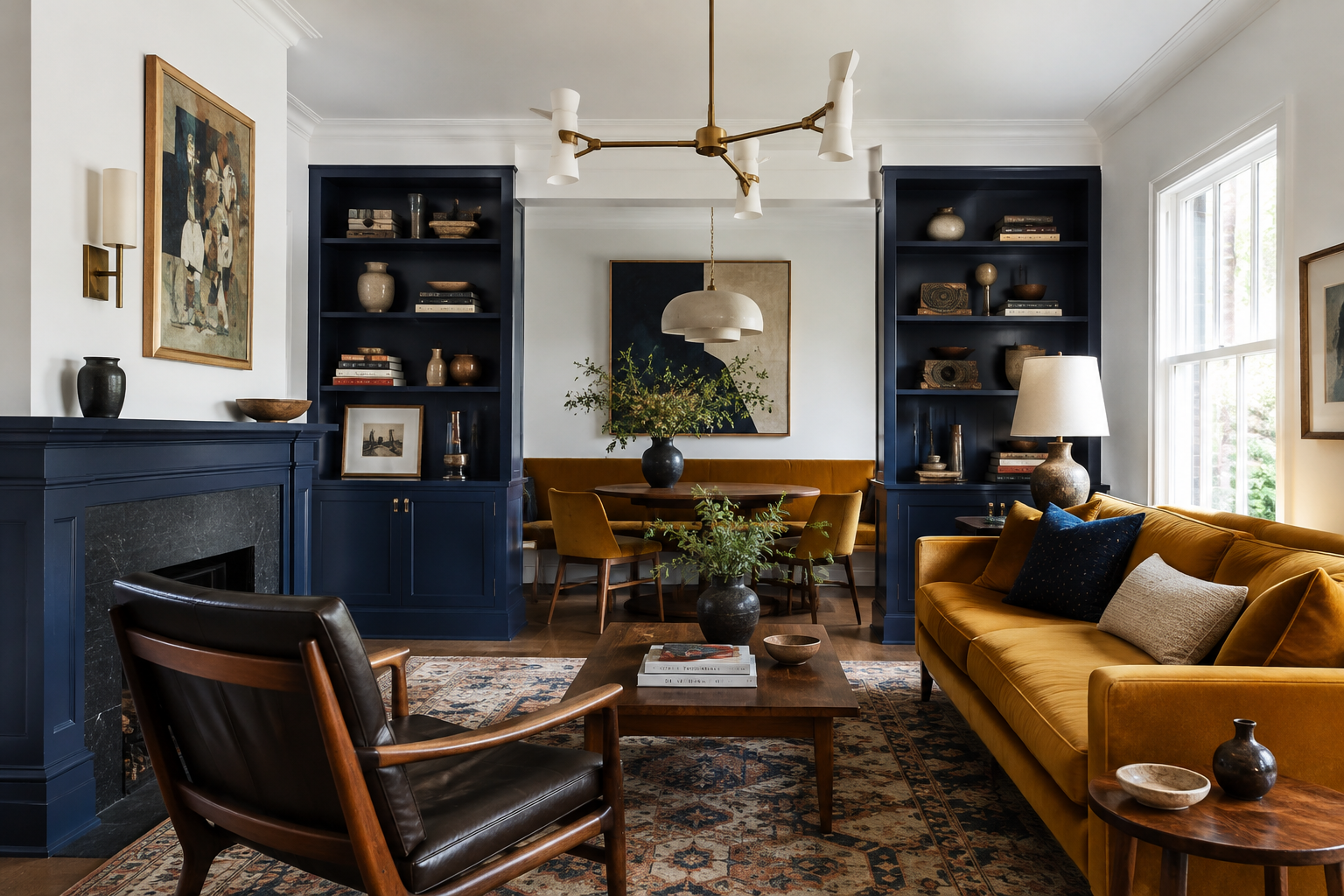
Green sits beside blue on the wheel, so olive and sage extend the scheme without interrupting it, and they land in the empty middle of its value range where nothing else is competing. Specify Sherwin-Williams Evergreen Fog 9130 at LRV 30 or Clary Sage 6178 at 41, and put the green on cabinetry, an accent wall, or upholstery. The three together read as coastal without the rope-and-anchor vocabulary, which is the version most designers are after.
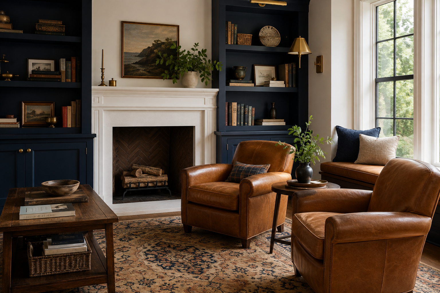
5. Caramel and Tan Soften the Contrast
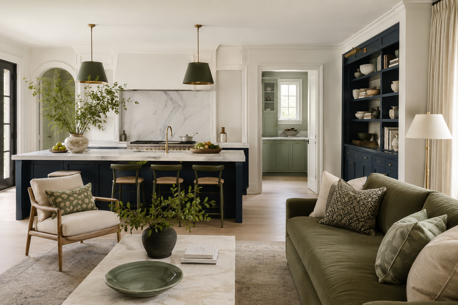
Brown works here in its lighter registers, where caramel, tan, and honey leather carry warmth without adding a second dark mass to a scheme that already has one. A tan leather chair or a caramel rug against navy and white is the most reliable way to make the pairing feel domestic, and the material matters as much as the color, since leather and wool return light unevenly and break navy’s flatness. Keep the deeper browns for floors, where they read as ground instead of a competing field.
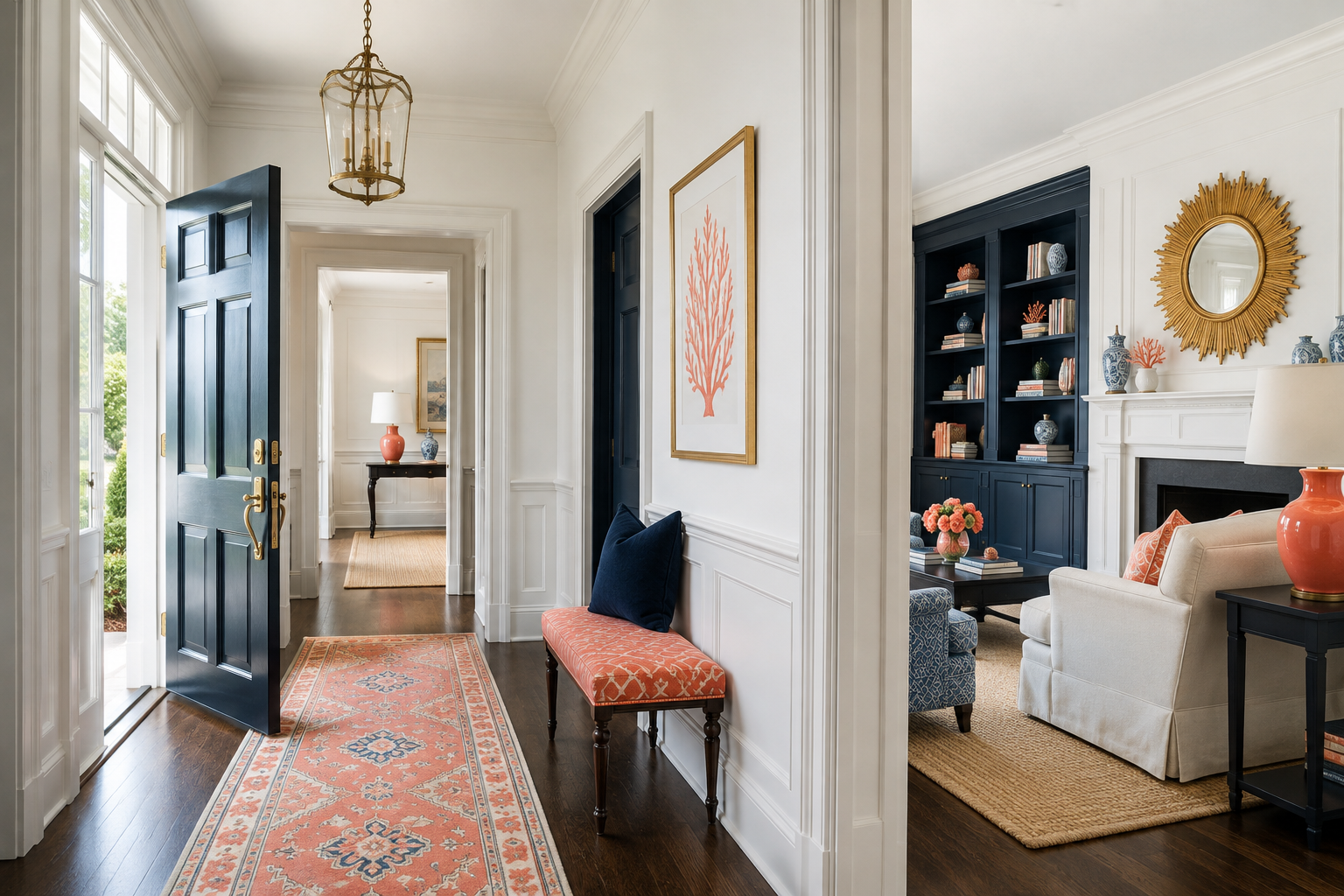
6. Coral Is Navy’s Actual Complement
Orange sits opposite blue on the RYB wheel, so coral and terracotta are the only accents here doing genuine complementary work — maximum hue contrast against a color that already holds maximum value contrast against its partner. Coral is the domesticated version, warm enough to flatter and light enough to sit in the scheme’s vacant middle register. Use it on textiles and ceramics at accent scale, since a full coral field against navy turns the room into a flag.
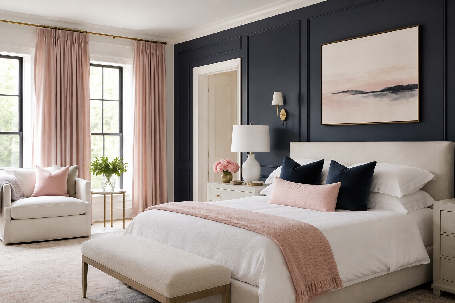
7. Blush Pink Turns It Contemporary
Blush is coral with the saturation removed, and it moves navy and white out of their traditional register entirely — the pairing stops reading nautical and starts reading current. It works best where the navy is deep and the white is warm, with the pink held to soft furnishings and one wall at most. The three together are a bedroom scheme more than a kitchen one, since blush against navy needs low light to keep its dignity.
8. Warm Gray and Greige, Never Cool
Gray belongs in this scheme only in its warm forms, and the distinction decides the room. A cool blue-gray beside navy produces a muddled middle where neither color is doing anything, while a warm gray or greige gives navy a neutral to sit against and keeps white from carrying the entire light load. Put it on large soft surfaces — a rug, a sectional, a wall in an adjoining space — and let navy stay the only blue in the room.

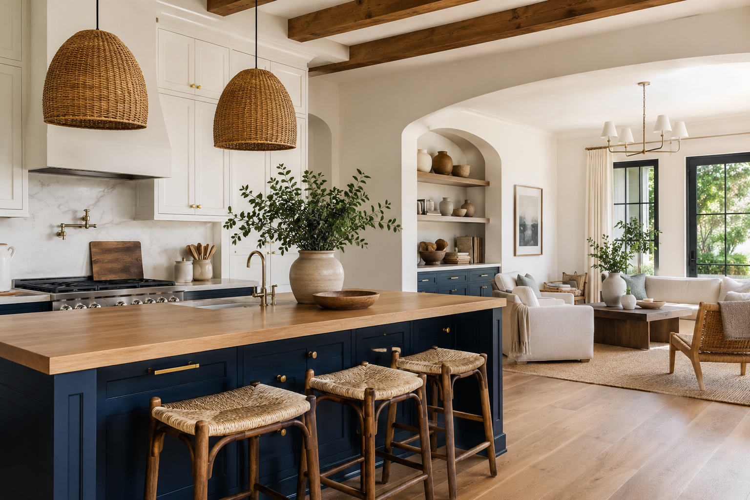
9. Natural Wood Carries the Warmth Without a Color
Wood is the accent that adds temperature without adding a hue, and it has become the most-specified one — a 2026 Houzz study of 1,780 renovating homeowners found wood cabinetry chosen by 29 percent against white’s 28 percent, the first time wood has led since 2016, with blue remaining the leading contrasting-island color. White oak, walnut, and rattan all work, and the grain does something no paint can, breaking navy’s flatness with a texture that shifts as light moves. This is the version of navy and white that reads least like a uniform.
The pairing’s value gap has a measurable payoff beyond appearances — white lettering on a navy ground clears the WCAG threshold of 4.5:1 for normal text at every size, and the combination has served signage, house numbers, and livery for as long as it has served rooms.
| Partner | Why it works | Specify | Best use |
|---|---|---|---|
| Brass & gold | Warm metal answers two cool colors | BM Golden Honey 297 · unlacquered brass | Hardware, lighting — the 10 percent |
| Mustard & ochre | Warmth with saturation — breaks the nautical read | Muted mustard, specify by chip | Upholstery, textiles |
| Olive & sage | Neighbors navy on the wheel; fills the empty mid-range | SW Evergreen Fog 9130 · SW Clary Sage 6178 | Cabinetry, accent walls |
| Caramel & tan | Warmth without a second dark mass | Tan leather, caramel wool | Seating, rugs |
| Coral & terracotta | Orange is navy’s RYB complement — true hue contrast | Coral or terracotta, by chip | Textiles, ceramics |
| Blush pink | Coral desaturated — moves the scheme contemporary | Blush, specify by chip | Bedrooms, soft furnishings |
| Warm gray & greige | Neutral ground; cool grays muddle beside navy | Warm greige, specify by chip | Rugs, large soft surfaces |
| Natural wood | Temperature and texture without a hue | White oak, walnut, rattan | Cabinetry, floors, furniture |
| Black | Sharpens navy’s edges; use linearly | SW Tricorn Black 6258 · LRV 3 | Window frames, hardware |
Colors That Go With Navy Blue and White FAQs
What colors go with navy blue and white?
Brass and gold, mustard yellow, olive and sage green, caramel and tan, coral, blush pink, warm gray, and natural wood. Navy and white already hold the widest value contrast in common use, so the accent’s job is warmth instead of contrast, and almost every reliable partner here is a warm color or a warm material.
What color do navy blue and white make when mixed?
Mixing navy paint with white produces tints of blue — progressively lighter and less saturated versions of the same hue, moving through slate and denim toward pale blue-gray, never toward a new color. Mixing and pairing are different questions — navy and white sitting beside each other stay themselves, while navy and white stirred together become a single lighter blue.
Is navy blue and white a good color combination?
Yes, and measurably so. Sherwin-Williams Naval publishes a Light Reflectance Value of 4.458 against Pure White’s 84, a separation of almost eighty points, which gives the pairing more built-in contrast than any other classic combination and leaves the middle of the value range free for an accent.
What is the difference between Hale Navy and Naval?
Benjamin Moore Hale Navy HC-154 carries subtle gray-green undertones and reads softer and more historic, while Sherwin-Williams Naval SW 6244 is more saturated and cleaner at LRV 4.458. Hale Navy asks for a warmer white such as White Dove; Naval accepts a near-neutral white like Pure White without turning icy.
Why is navy blue called navy blue?
The Royal Navy adopted dark blue and white for officers’ uniforms in April 1748 under regulations issued by Lord Anson, and the color took its name from that use. It was called marine blue first, and the Oxford English Dictionary dates navy blue to 1813; the story that George II chose it after seeing the Duchess of Bedford’s riding habit is apocryphal.
Related Links
What Color Goes With Chocolate Brown
What Color Goes With Purple And Green
What Color Goes With Black And Gold
What Color Goes With Tiffany Blue
Hard Hat Color Codes & Their Meanings
What Color is Mikado and How You Can Use It in Your Home Décor
What Color is Teal and How You Can Use It in Your Home Décor
How to Use Lavender Color to Your Advantage in Home Décor
Colors That Go With Gray and How to Decorate With Gray
What Chartreuse Color Is and How to Use It in Home Décor Splendidly

