

The mid-century modern kitchen we build today runs on flat-front walnut cabinets, long horizontal lines, and restrained hardware — and almost none of it existed in 1955. The real mid-century kitchen was enameled steel and Formica, pastel and proud of it, and knowing both versions is what separates a considered renovation from a mood board: one is the era’s furniture language translated into cabinetry, the other is what the era actually installed. This guide covers both honestly — the thirteen ideas below open with the contemporary translation the search results want, close with the historical original it descends from, and name the materials and rules that make each one work. The same translation story runs through the whole house, from the mid-century modern bedroom to the bath, and the kitchen is where it gets most interesting, because here the modern version and the real version disagree the most.
The Kitchen the Era Actually Built
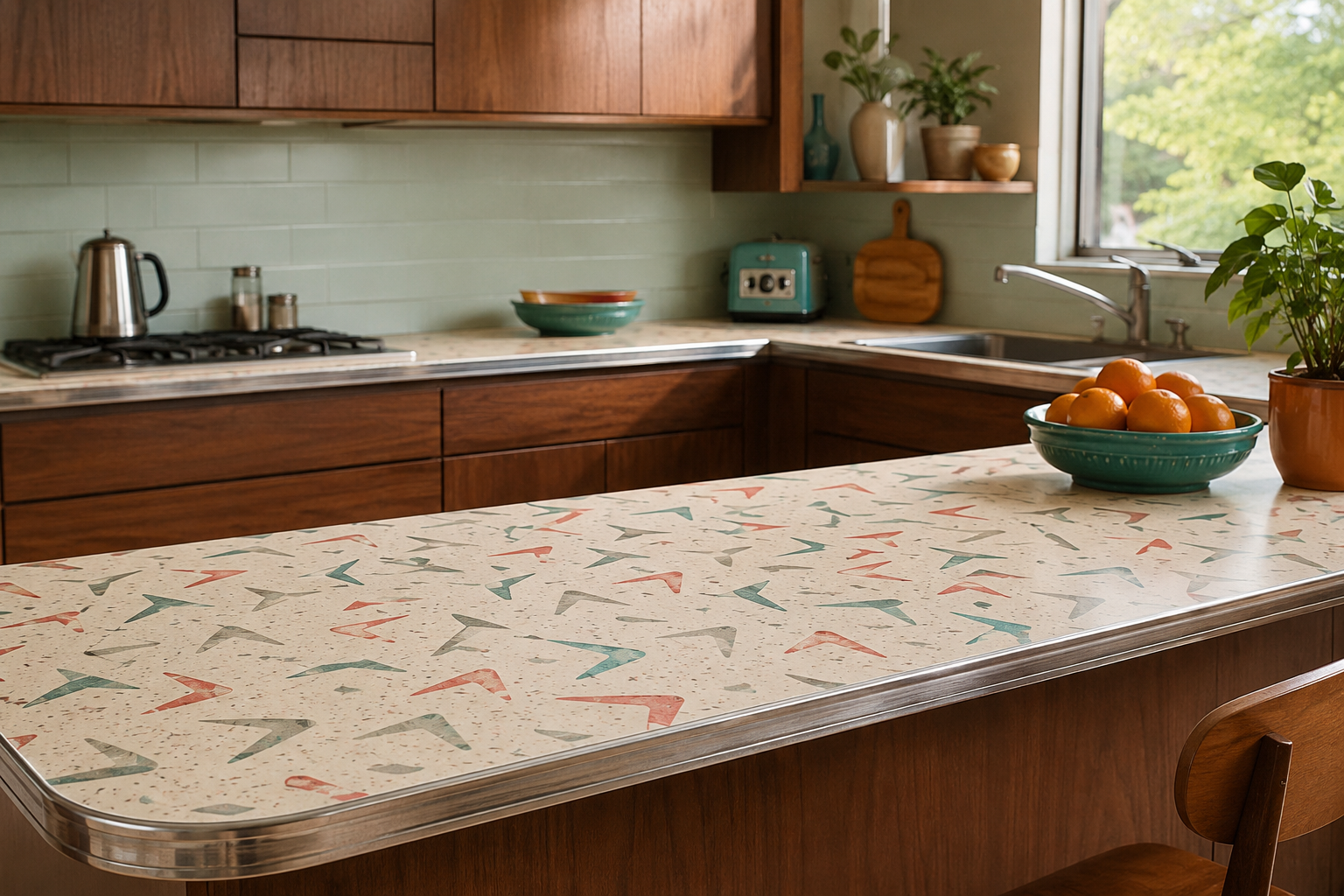
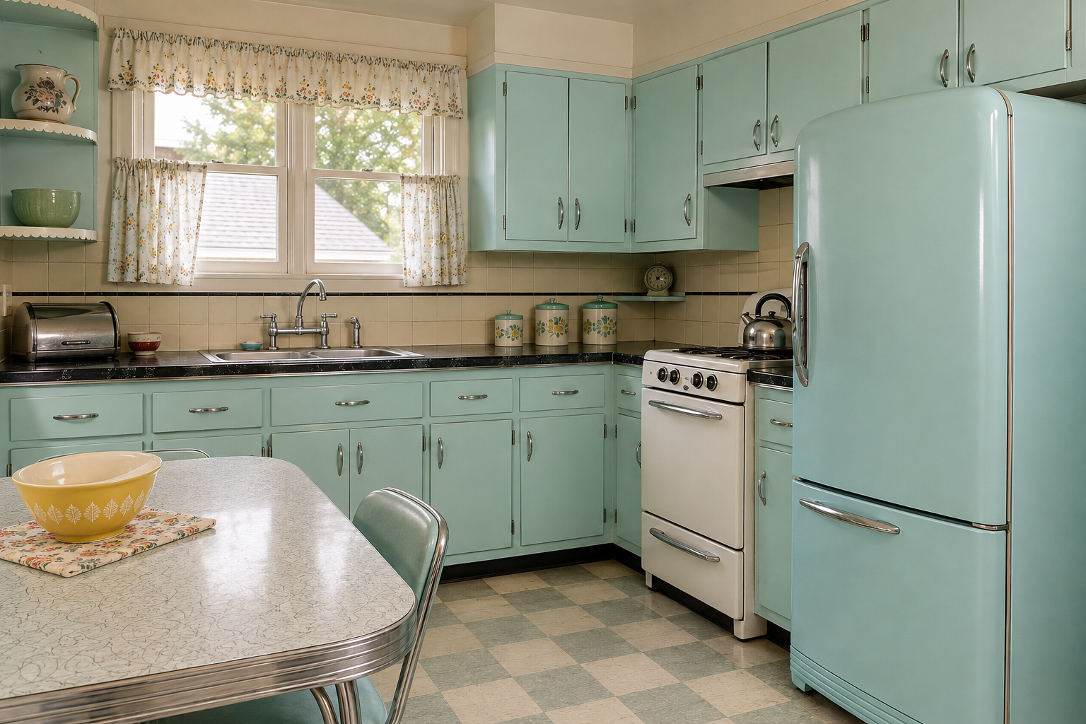
Walk into an untouched 1955 kitchen and you will not find walnut. You will find steel: modular enameled-steel cabinet systems from Youngstown, St. Charles, Geneva, and Republic — smooth, wipe-clean, and sold as the future, with St. Charles holding the top of the market. The counters were laminate, and their story is better than it sounds: Formica was invented in 1913 as an electrical insulator and reached kitchens only in the late 1940s, when its wipe-clean durability met the postwar dream kitchen; its 1949 Color Range and the boomerang-patterned Skylark that followed put atomic-age graphics on the American counter, and clean original boomerang laminate is genuinely collectible today. From roughly 1953 to 1963 the palette went pastel — pink, aqua, and yellow cabinets with appliances color-matched to them — while the breakfast booth, the pass-through, and the wall-mounted oven made the kitchen a designed room rather than a service one. The dishwasher, for all its presence in the period’s advertising, stayed rare in real houses until well after the era closed. The walnut kitchen came later, translated backward from the era’s furniture — and it earned its place. What follows is that honest taxonomy.
1. Flat-Front Walnut Cabinets
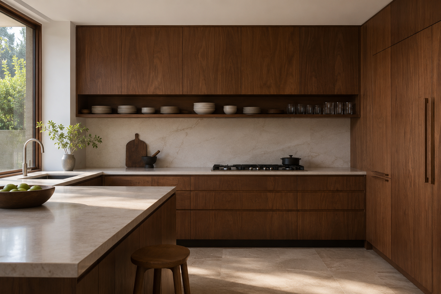
The flat-front walnut kitchen is the contemporary translation’s anchor: slab doors and drawer fronts in walnut or walnut veneer, no raised panels, no molding, the cabinet reading as furniture rather than millwork. It borrows directly from the era’s credenzas — the same grain, the same restraint — which is why it pairs so naturally with the bedroom and living room pieces the style is famous for. The commitment is maintenance-light but design-strict: once the fronts are slabs, every adjacent choice (counter, hardware, backsplash) either supports the calm or breaks it.
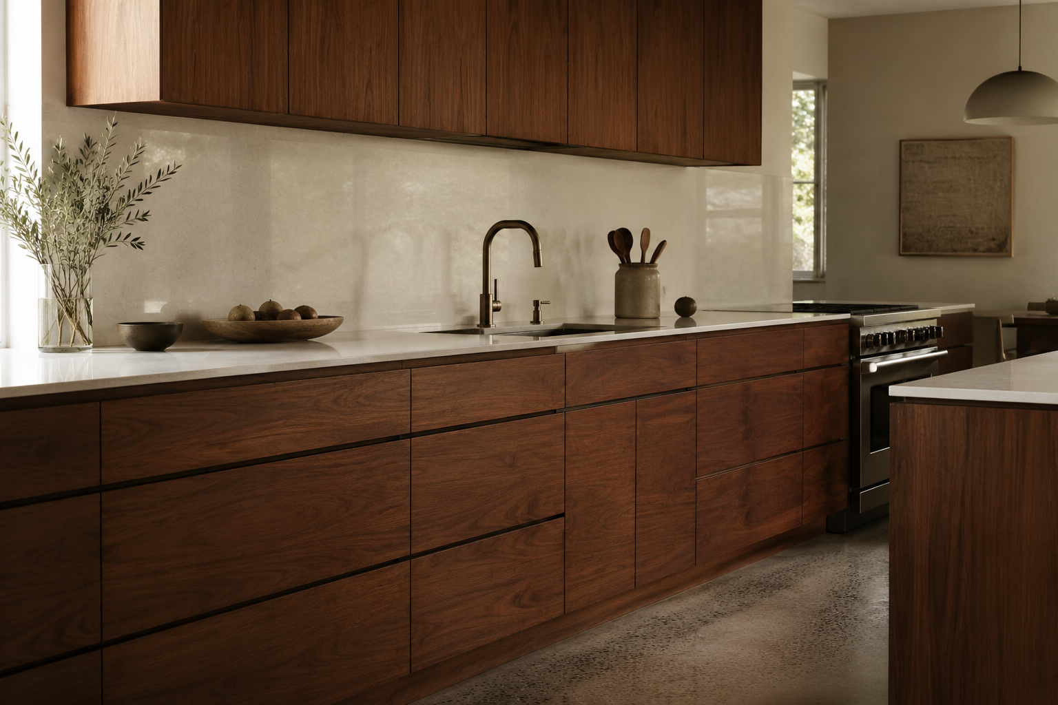
2. Run the Grain in One Direction
Grain-matching is the detail that separates the furniture-grade version from the flat-pack one: veneer sequenced so the grain flows continuously across drawer fronts and doors, horizontal lines running unbroken down the cabinet run. It costs more and reads instantly — the kitchen becomes one long composition instead of a grid of rectangles. Walnut’s range makes the sequencing matter even more, a spread our primer on walnut color maps from pale chocolate to near-black.
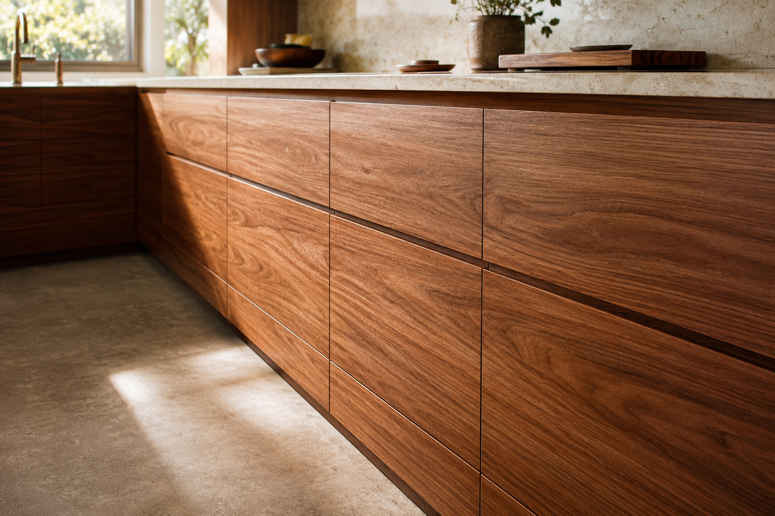
3. White Oak and Pale Stone
The white oak kitchen is the lighter, Scandinavian-leaning translation: rift-sawn oak in a matte or cerused finish, honed pale stone or quartz above, brushed nickel or black hardware. It trades walnut’s warmth for brightness and hides wear better in hard-water households. The rule that keeps it mid-century rather than generic-modern is the same as everywhere in the style: slab fronts, visible grain, long horizontals, and nothing pretending to be another material.
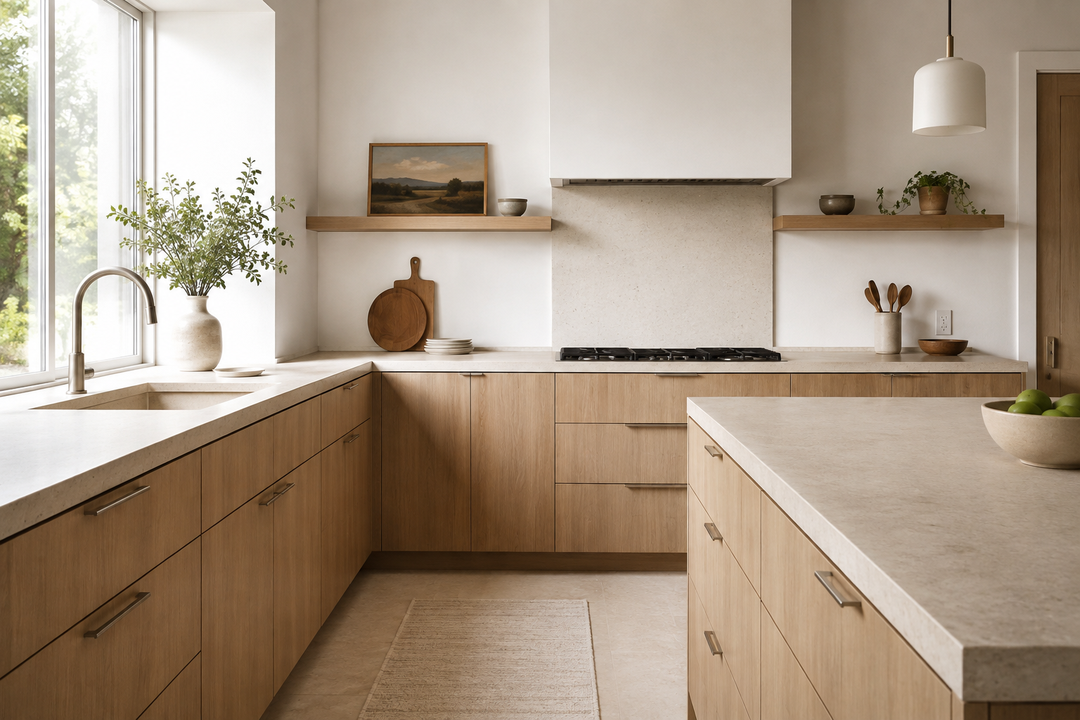
4. Two-Tone, the Era’s Way
The two-tone kitchen has period paperwork: by the late 1950s, steel-cabinet makers were shipping two-color kitchens, and the current wood-below-color-above formula — walnut base cabinets under painted or matte-black uppers, or color on the island only — continues that logic. The discipline is a hard limit of two tones plus metal, with the boundary between them drawn once and kept: wraps, accents, and third colors turn a scheme into a sampler.
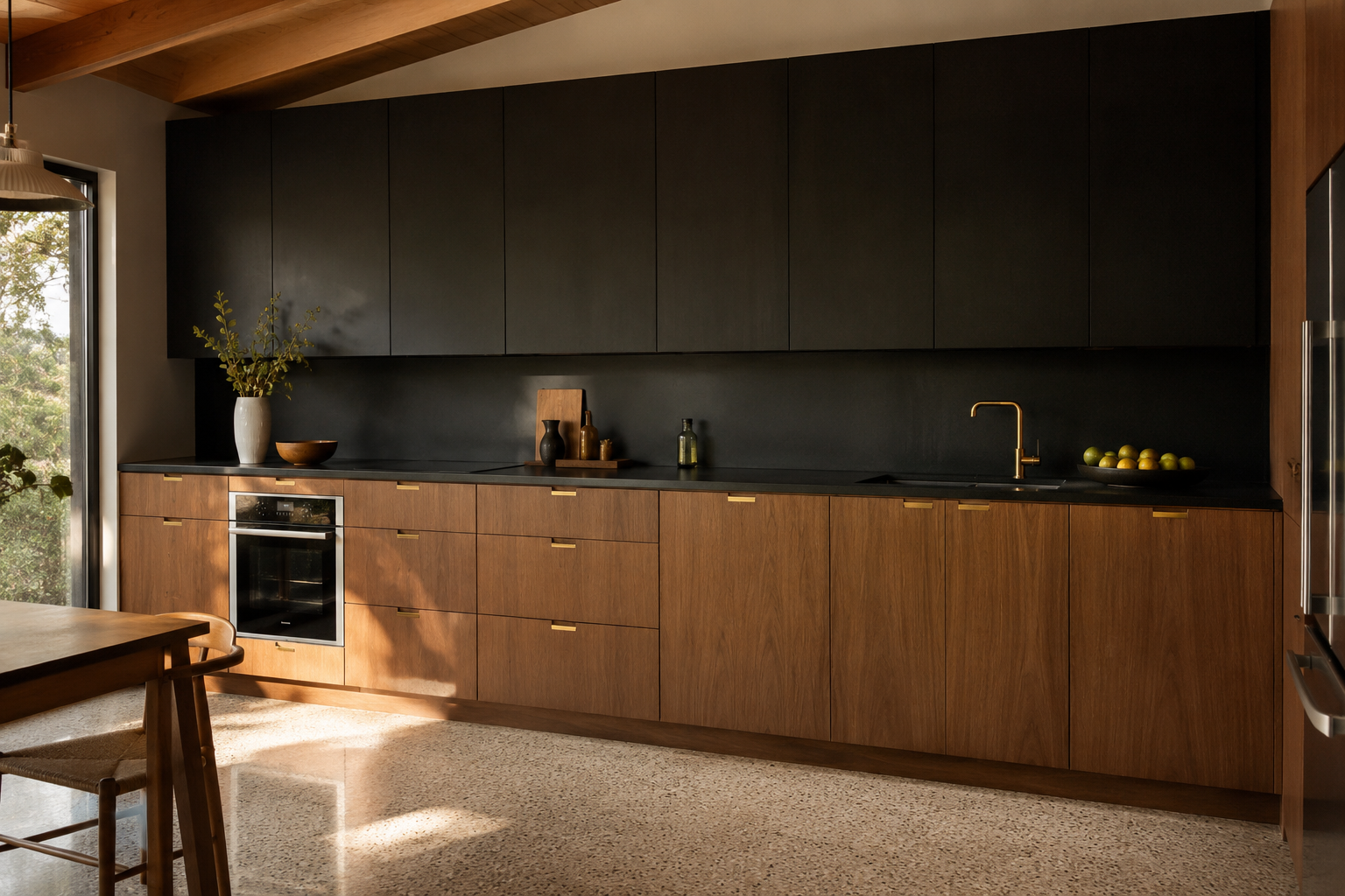
5. Rehabilitate the Laminate
Laminate is the only countertop with a genuine mid-century pedigree, and treating it as a budget compromise gets the history backward: it was the era’s proud, chosen surface. The current case is practical as well as historical — modern laminates run far more durable than the originals, the classic patterns (boomerang included) exist in reissue, and on a tight renovation the money laminate saves buys grain-matched fronts that matter more visually. Stone remains the premium translation; laminate is the period-correct one, and specifying it knowingly is the opposite of settling.
6. Color the Appliances
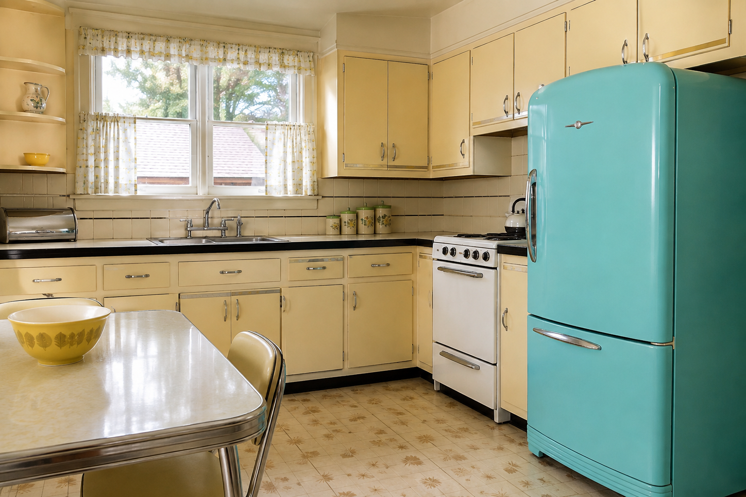
The era matched its appliances to its rooms — pink, turquoise, yellow — and the current revival of period appliance colors makes the move available again without the vintage electrics. One colored anchor appliance (the range or the refrigerator, not both) against calm cabinets reads confidently retro; a full matched set in a small kitchen reads like a diner. Chrome and stainless hold the neutral end, and the era’s chrome-heavy hardware language backs either choice.
7. Open Shelving, Rationed
The period displayed its dishware — glass-front cabinets and open shelves were how the 1950s kitchen showed it had thought of everything — but it displayed selectively. The workable modern ration is one run of open shelving, styled with things actually used weekly, against a majority of closed slab-front storage. The all-open kitchen photographs well once and works badly forever; the era, which cooked three meals a day in these rooms, never proposed it.
8. Build the Breakfast Nook
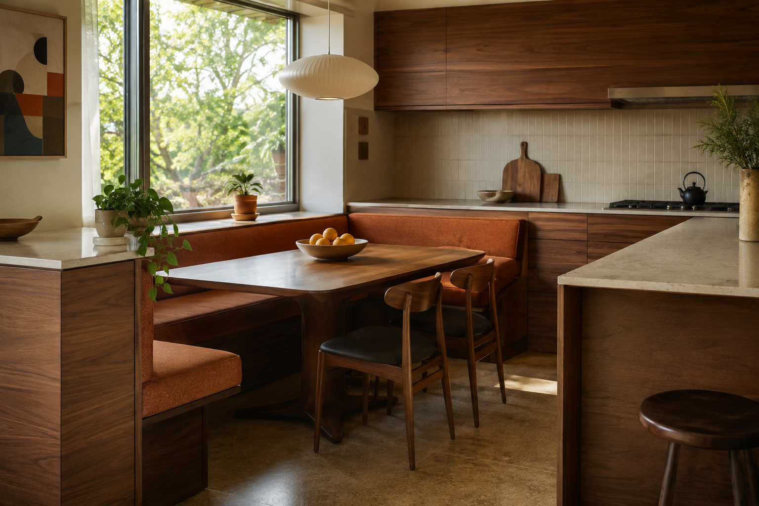
The banquette booth is the era’s happiest invention and its most underused revival: a built-in bench and table in a corner or bay, upholstered in something wipeable, seating four in the floor area two chairs waste. Period versions sat beside knotty pine and yoke lights; the translation does it in walnut and wool. In open plans it also does the zoning work walls used to do, giving the kitchen a social edge without adding a single partition.
9. Open the Pass-Through
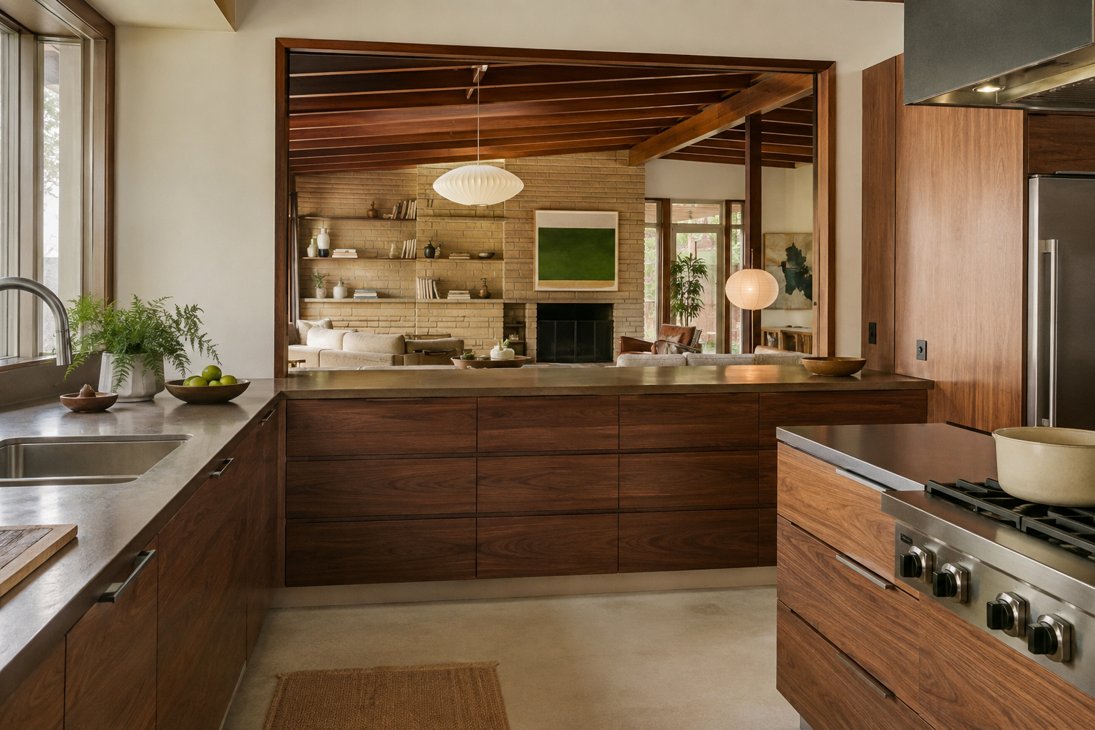
Mid-century houses began the demolition of the closed kitchen — pass-throughs, breakfast bars, and kitchens opening to family rooms all date to the era’s plans — and the modern open kitchen is that idea carried to its conclusion. The translation worth copying is the partial version: a framed opening or peninsula that connects without merging, keeping the kitchen legible as a room. The full survey of how the era’s houses handled it is in our tour of mid-century homes, and the layout fundamentals in our guide to kitchen layouts.
10. Square Tile, With a Trim Course
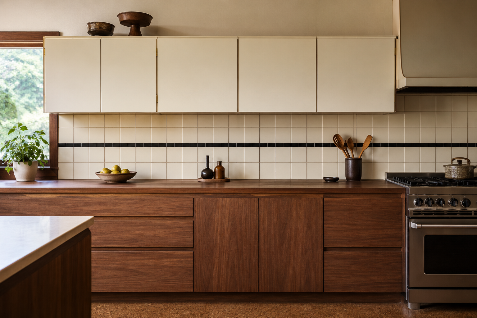
The period backsplash was 4×4 tile, often with a contrasting trim course drawing one line through the field — a graphic move the subway-tile decade forgot. The translation runs the square tile in matte white, cream, or a period green, with the trim line in black or the room’s accent color. It is cheaper than zellige, more period-correct than subway, and the single contrasting course does more design work than any amount of artisanal irregularity.
11. Floors: VCT, Cork, or Checkerboard
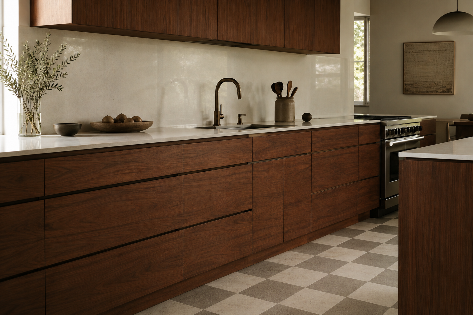
The era’s floors were resilient: vinyl composition tile in solids and checkerboards, linoleum, and cork — warm underfoot, quiet, and forgiving of dropped dishes. All three survive as current products, VCT remaining the honest budget champion and cork the comfort pick, and a checkerboard in muted tones (not stark black-white) anchors a pastel or two-tone scheme instantly. Wood works in the translated kitchen; the resilient floor is the one with the period passport.
12. Light It Like the Living Room
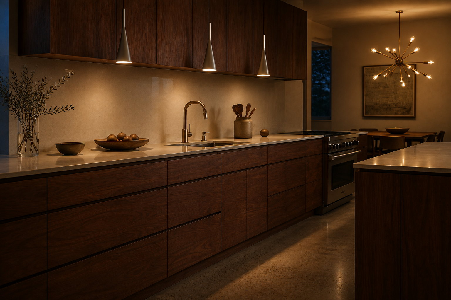
The mid-century kitchen took its lighting cues from the rest of the house: a sputnik or globe pendant over the table, a row of simple cones or cylinders over the counter run, warm color temperature throughout. The translation adds task lighting the era lacked — under-cabinet strips, properly placed — but keeps the visible fixtures sculptural and few. Recessed-can ceilings flatten exactly the atmosphere the fixtures exist to build.
13. The Full Throwback
The list closes where the history began: the faithful restoration or recreation — steel cabinets (restored originals or the current makers reviving the type), boomerang laminate, pastel appliances, square tile with a trim line, VCT floor. It is the most historically honest kitchen in this guide and the boldest, the same position the pastel bathroom holds in our mid-century modern bathroom vanities guide, and it comes with the same warning label: this is a commitment, not an accent. Done fully, nothing else in the house photographs like it; done halfway, it reads as a theme. The era went all in, and the throwback only works the same way.
What makes a kitchen “mid-century modern”?
In the contemporary sense: flat slab fronts in walnut or white oak, continuous grain, long horizontal lines, minimal hardware, two-tone restraint, and lighting chosen as sculpture. In the historical sense: enameled steel cabinets, laminate counters, pastel color, and built-in efficiency. Both are legitimate; knowing which one you are building is the first design decision.
Were real 1950s kitchens made of wood?
Mostly no — the signature postwar kitchen was enameled steel, from makers like Youngstown, St. Charles, and Geneva, with laminate counters. Painted wood existed, especially early in the era, but the walnut kitchen sold as “mid-century” today is a later translation of the era’s furniture into cabinetry. Honest sellers and designers describe it that way.
What countertop is period-correct for a mid-century kitchen?
Laminate, without apology — it was the era’s chosen surface, introduced to kitchens in the late 1940s and worn proudly in patterns like Formica’s boomerang Skylark. Honed stone and quartz are the premium modern translations and work beautifully; they are simply not what the period installed.
What colors did mid-century kitchens use?
Softer than memory suggests: the 1953–1963 wave ran pastel pink, aqua, turquoise, and yellow, with two-tone schemes arriving late in the era. The harvest gold and avocado everyone pictures belong to the later 1960s and 70s. For the translated kitchen, wood plus one saturated accent keeps the period’s confidence without the commitment.
Is the mid-century kitchen going out of style?
The translated version — slab fronts, real wood, long lines — is the closest thing cabinetry has to a permanent style, and renovation surveys keep wood-tone kitchens rising. What dates is accessory-level retro: one boomerang cushion in an otherwise builder-grade room. Commit to the system at cabinet level and the kitchen ages like the furniture it quotes; the durability logic in our guide to timeless kitchen design applies here in full.
Resources
- Retro Renovation — The History of Vintage Steel Kitchen Cabinets (100 Brands)
- Formica Corporation — Company and Pattern History (1913 Onward)
- Click Americana — Mid-Century Kitchen Archives
- Very Vintage Vegas — The Decade That Changed Our Nation’s Kitchens
- Architecture Lab — 13 Mid-Century Modern Bedroom Ideas
- Architecture Lab — Walnut Color, Explained
- Architecture Lab — Mid-Century Homes


